Bonus Material: How to Reduce Cart Abandonment – 17 Advanced Strategies Guide
The average eCommerce conversion rate in 2021 was 2.9% across all industries.
That’s a lot of wasted traffic that could be driving revenue — if only you could convince those users to convert.
The reality is, no matter how high your conversion rate, the majority of your visitors will leave without making a purchase.
However, increasing your eCommerce conversions even just a few percentage points can have a significant impact on your revenue, customer lifetime value, and channel profitability.
Not sure where to start? Here are 11 eCommerce conversion rate optimization strategies to drive your conversions up and increase your revenue.
#1. Leverage Customer Intent to Win the Sale
#2. Offer Free Shipping (Selectively)
#3. Recover Hijacked Customers Your Competitors are Stealing
#4. Leverage Dynamic Site Content
#5. Use Augmented Reality to Help Users “See” Products
#6. Reduce Shopping Cart Abandonment
#7. Optimize Your Store’s Checkout Funnel
#8. Offer Ample Payment Options
#9. Reduce Risk for Your Customers
#10. Implement Multiple Customer Touchpoints
#11. Tap Into the Power of Social Proof
#1 eCommerce Conversion Rate Optimization Strategy: Leverage Customer Intent to Win the Sale
Customers like a good deal. In fact, around 60% of shoppers look for a coupon before making an online purchase[*].
However, online profit margins are often tight, making it hard to profit if every customer has a coupon or discount code.
The good news? You don’t have to compete on price to drive revenue.
Instead of offering blanket discounts to everyone, consider using Intent-Based Promotions. These individualized incentives consider user intent when calculating promotions. This allows you to offer users the lowest possible discount to drive conversions.
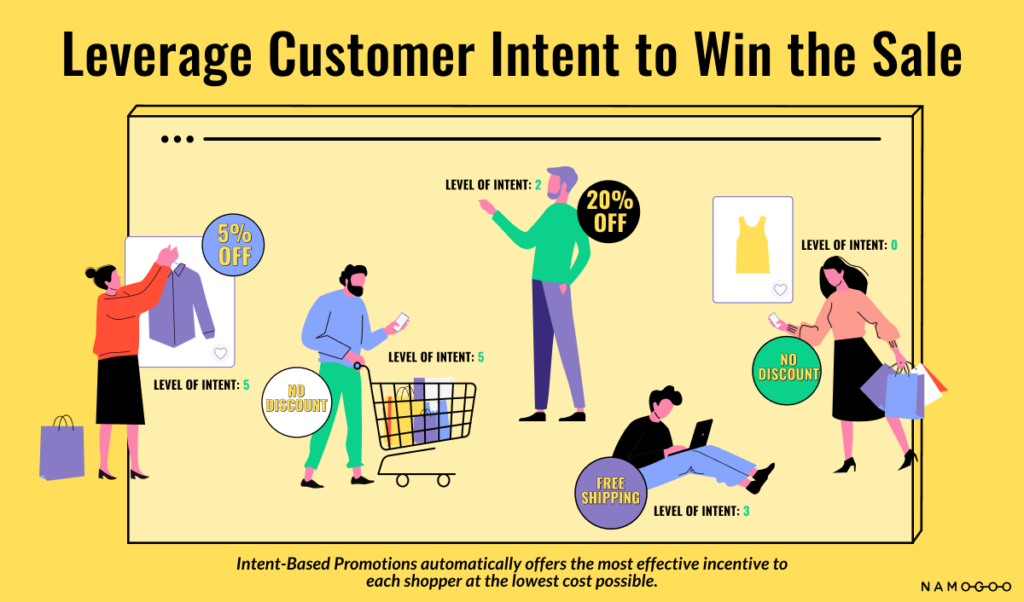
For example, a user who has looked at a specific item two or three times might need just a small discount to push them to convert. Rather than offering every customer, for example, a 15% welcome discount, you may not need to offer any discount at all to some types of online shoppers.
While you might want to use discounts to encourage other actions — like growing your email list, intent-based promotions can help you reach your conversion goals and protect your bottom line.
Remember: You’re already using customer intent to bring in traffic. Start leveraging customer intent for those pivotal moments of conversion that are happening on your site.
#2. Offer Free Shipping (Selectively)
You’ll find advice to offer free shipping in most beginner guides to conversion rate optimization.
That’s because it’s a strategy that usually works in increasing conversion rates. One study found 75% of consumers expect delivery to be free, even for orders under $50[*].
Furthermore, 77% of shoppers cited that free shipping was their favorite promotion.
Respondents from eCommerce giants like Amazon have trained online shoppers to not only expect shipping to be free, but they expect it to be fast, too.
The problem with this advice? It fails to look at the whole picture. It assumes that all eCommerce brands have comfortable margins and ignore other, competing goals like driving average order value and customer retention.
Shipping costs are on the rise, which can eat into your profit margins, and offering free shipping on every single order can put brands in a marginless position if they’re not careful.
So while offering free shipping is a simple way to increase your eCommerce conversion rate, you can accomplish the same goal strategically by setting a minimum order amount to receive free shipping.
Consider offering free shipping for orders over a specific threshold, such as $30 or $50. Check out how Namogoo customer Allbirds, offers free shipping for orders over $50:
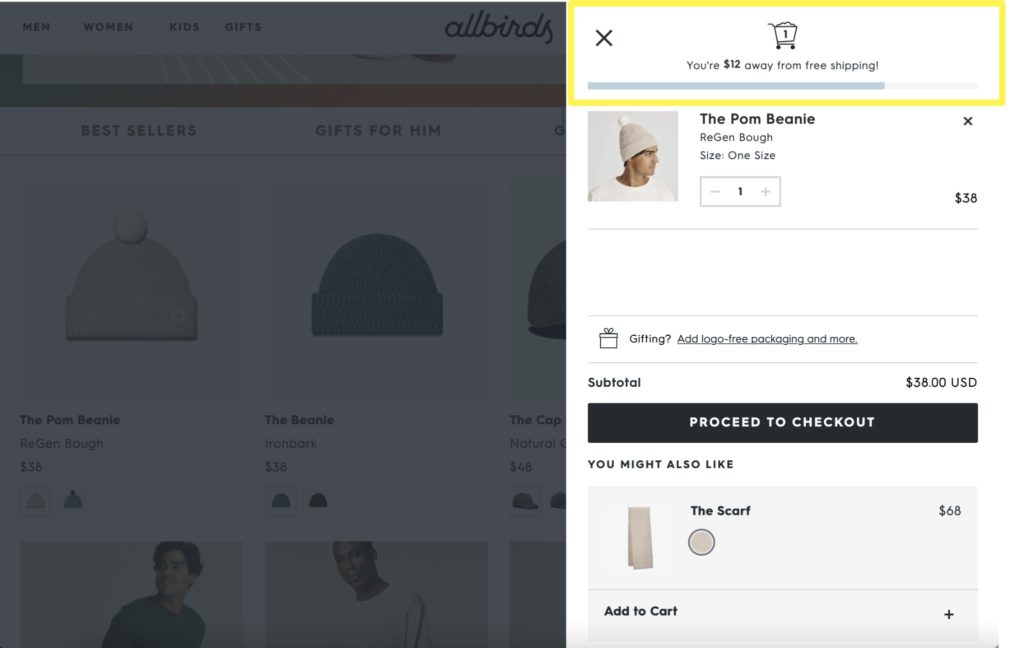
The footwear brand promotes the free shipping threshold through their website’s top bar as well as with a progress bar in the cart slider.
Protip: Set your free shipping threshold just over your average order value so you can make this strategy pull double-duty by improving your store’s AOV and conversion rates.
Implementing a free shipping threshold will encourage buyers to increase their cart size, driving up the average order value.
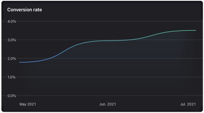
Implementing free shipping over a $39 threshold on my Shopify store in mid-June of 2021 was one of the main drivers of a nearly 95% increase in conversion rate over 3 months:
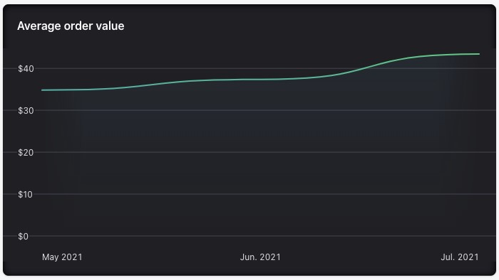
While simultaneously improving average order value by 25%.
Alternatively, you could offer free shipping to users who abandon their carts or users who create an account as an additional incentive to complete the desired action… or check out.
#3. Recover Hijacked Customers Your Competitors are Stealing
Sometimes, everything seems to be going right. Your conversion funnel is working, your average order value is increasing, and your storefront is streamlined and easy to use.
But what if your conversion rates still don’t budge?
The problem might not be your fault — other brands might be hijacking your customers at the last moment.
Here’s how it happens:
A potential customer lands on your site. Perhaps you piqued their interest with an email campaign or a Facebook ad. They are primed for conversion and are ready to buy. They might even add an item to their cart.
Then, they see an ad on your site (yes, an ad that your team didn’t authorize) that draws them to leave your store.
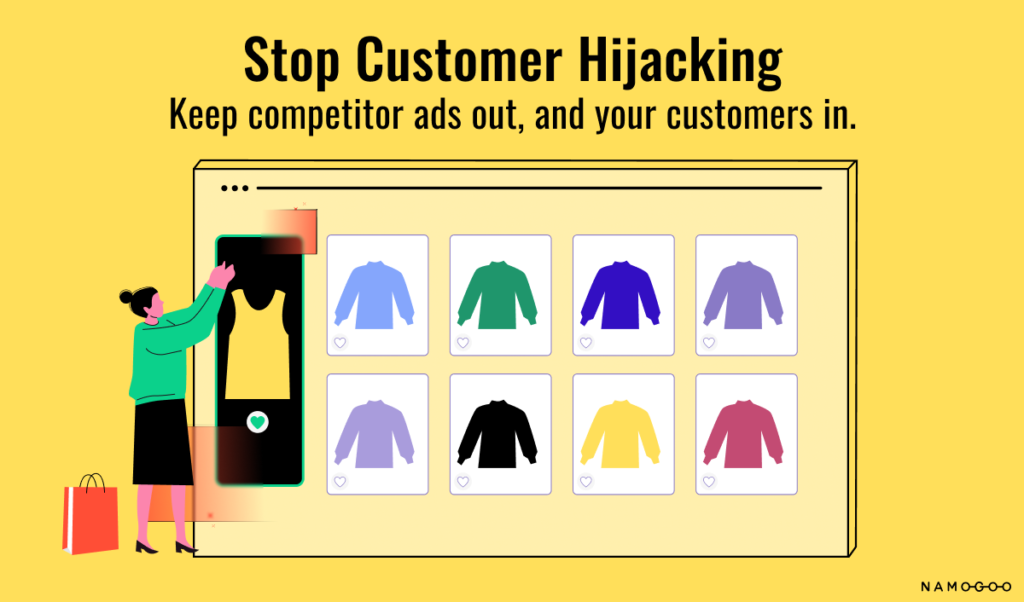
How do ads show up on your website without your consent? Through an ad injection. The ads show up on customers’ devices, not on your servers. This means they could be luring your customers away without you even realizing it.
Customer hijacking can draw away 20% or more of your traffic, costing you conversions and wasting your acquisition efforts.
How do you prevent this from happening?
By using a solution like Namogoo’s Customer Hijacking Prevention. We use algorithms and AI to identify these ads in real-time and then block these unauthorized ads. By adding just a small piece of code, you can keep those customers on your site and drive conversions.
#4. Leverage Dynamic Site Content
Like personalized promotions and dynamic ads, dynamic content delivers hyper-relevant site content to users based on past actions.
You might have experienced this yourself while searching for hotels or flights. The site might auto-populate your destination in the search form or even adjust the entire landing page to your searches:
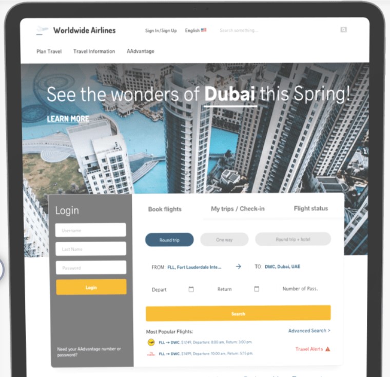
eCommerce brands can also use dynamic content to encourage conversions.
Use dynamic content to offer personalized recommendations based on search or purchase behavior, suggest more relevant gift guides, or adjust landing pages to users’ search queries.
For example, a user who viewed camping gear might see a sale on tents on your homepage, while a user looking for dog toys might see dog-related items.
Check out how the apparel brand Something Navy serves AI-driven dynamic product recommendations:
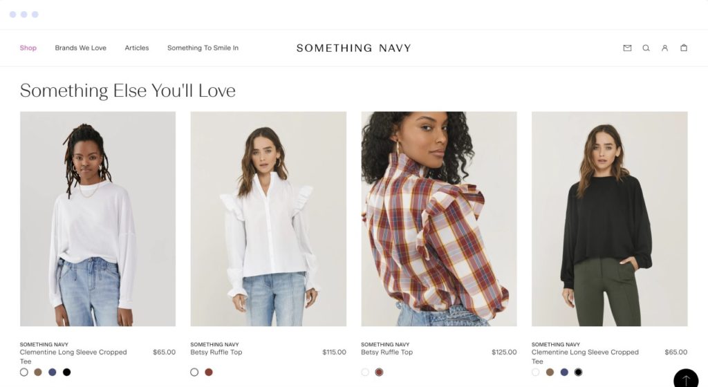
This helps to personalize the customer experience to each individual, thereby driving conversions.
Read More: Personalized Marketing: What It Is & How to Use It to Drive Loyalty & Sales
#5. Use Augmented Reality to Help Users “See” Products
Online shopping is commonplace, but there’s one major drawback, especially for home and apparel brands. Customers often want to try on items or touch them in person before buying.
A solid return policy can encourage users to overcome hesitancy as we’ll see shortly, but shipping and restocking costs can also eat into your margins.
Augmented reality allows users to see how items will look in real life — either in their home or on their body.
Warby Parker, a brand known for disrupting the eyeglass industry, developed an app to solve this problem for their customers:

Users can upload a picture of themselves to the app and “try on” the frames they are interested in to see how specific frames will look on their face.
Amazon offers a similar feature on its mobile app. Users can see how a couch, bed, or other home items looks in their actual space through their phone’s camera.
For eCommerce shoppers, being able to “see” items in real life can help convince them to hit “Complete Order”
#6. Reduce Shopping Cart Abandonment
The average cart abandonment rate is nearly 70% for eCommerce stores. Obviously, this does a number to your conversion rates[*], and it’s even more painful than losing a casual visitor.
Shopping cart abandoners are so close to converting, but they just never quite make it over the finish line.
When your cart abandonment rate decreases, your conversion rate will increase as a result; they are confounding metrics. So focusing on improving this metric can provide a lot of leverage.
The first step to recovering those abandoned carts is determining why shoppers didn’t complete their purchases.
Common reasons vary by company and even industry, but often include:
- Difficult-to-navigate online store
- Unexpected costs or fees, including shipping and taxes
- Low purchase-intent traffic
- Lack of trust in your store
- Price
- Couldn’t find a coupon code
- Lack of reviews
- Limited shipping options
Use A/B testing to discover why users abandon their carts, then implement strategies to mitigate lost conversions. For example, does adding trust signals or different payment options increase conversions?
Testing a few tweaks can bring your abandoned cart rate down — and your conversion rates up.
#7. Optimize Your Store’s Checkout Funnel
A long, complicated checkout process is an easy way to lose your traffic. The longer visitors spend in the checkout process, the more likely they are to second guess their purchase or decide they don’t need that item, after all.
It’s not uncommon to see an increase in checkout abandonment with every step in the onsite conversion funnel:

Aim to make the checkout process as smooth as possible by reducing clicks, making the next step obvious, and using autofill whenever possible.
If you already have those things covered, try a few more advanced UX strategies to improve your checkout process:
- Use single-page checkouts when possible. They often convert better.
- Use short forms and only ask for necessary information.
- Don’t require a sign-in to complete a purchase.
- Emphasize key differentiators on the checkout page, such as free shipping or a robust return policy.
- Include trust signals on your checkout page.
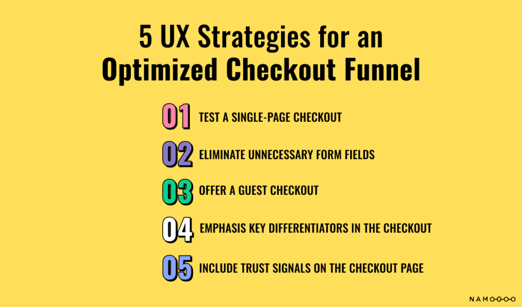
The checkout page is the last page users see when they are completing their purchase. It can cinch a conversion — or lose it. Make sure yours is working hard for you.
Read More: How to Reduce Shopping Cart Abandonment Rate: 17 Advanced Strategies
One thing that can have a direct and dramatic effect on your conversion rate is how a shopping cart is expressed onsite. The different modalities of digital carts can either reduce or introduce steps to the checkout funnel. So this next strategy is an important one to get right:
Test Different Shopping Cart Modalities
While there is some debate in the Conversion Rate Optimization world about whether an ajax cart converts better than sending users to the cart page, there’s no blanket rule to say which will work best for your brand.
However, there are several different cart modalities, including:
1. The cart page. This is the typical conversion path onsite. When a user presses the “Add to Cart” button on an eCommerce site, they are taken to the cart page where they can review the contents of their digital shopping cart.
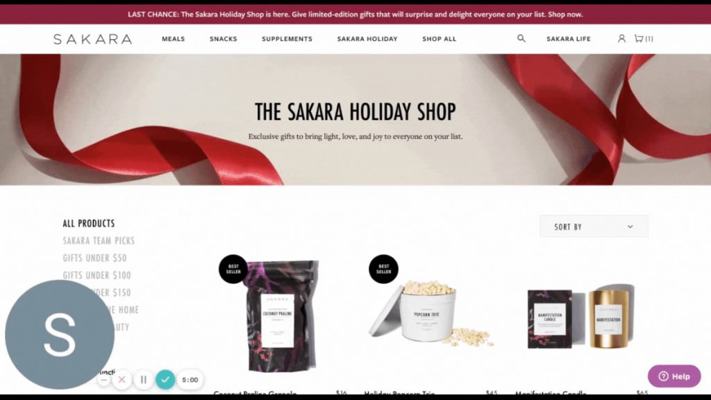
2. The cart slider. This cart type is becoming more common in eCommerce. The cart slider (aka cart drawer) slides out from the side, typically the right, when a product is added to the cart. The page the user was on may be blurred out like on Sakara’s website:
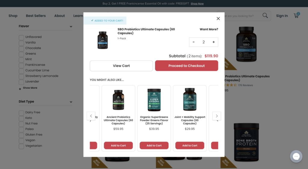
3. The cart pop-up. While this is not as commonly seen as the other approaches, a cart pop-up is another type of cart designed to reduce interruptions to the checkout flow. When an item is added to the cart, it displays in a pop-up box. It can be either a traditional pop-up that takes over the user experience, like this one:
Or it can be a smaller pop-up that disappears after a couple of seconds, like the one shown below on ASOS.
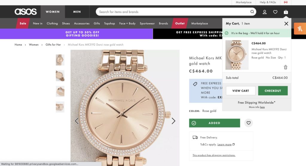
This may be good for online marketplaces with a lot of skus, as it encourages visitors to continue browsing and adding items to their carts.
4. A hybrid approach. Many online stores opt for a combination of either a cart pop-up or a cart slider as the first step in the checkout funnel. Then, when it’s time for the user to complete their order, they are taken to the cart page to review the contents of their shopping bag.
Swapping the cart page out for one of the other, more streamlined cart types may increase conversions for your store, but we don’t recommend making these changes until you’ve A/B tested them for yourself. After having tested different cart modalities across several eCommerce brands’ websites, there is no clear winner. It depends on your industry, products, and pricing, the type of customers you attract, the channels through which you drive website traffic, and your overall user experience.
So while it’s crucial that eCommerce teams get this UX aspect right, it’s equally important to test for yourself to see what will convert the best.
#8. Offer Ample Payment Options
As an online shopper, there’s nothing worse than spending time browsing a store, locating the product you want to purchase, and then having problems with your payment method at checkout… or realizing that you don’t have enough room on your credit card to complete your order.
Offering customers plenty of payment method options at checkout can reduce this friction, speed up the checkout process and drive conversions.
While all stores offer basic methods like credit card payments, high-converting stores expand from there by enabling both express checkout and payment plans.
Accelerated Payment Methods
One of the reasons giving your customers payment options can increase conversion rate is that many popular methods are quick-pay options.
This means that your customers spend less time entering their payment details, which is a headache and can drive users to abandon their checkout.
Accelerated methods include:
- Apple Pay
- Shop Pay (Shopify)
- Facebook Pay
- Google Pay
- Amazon Pay
- PayPal.
Shopify stores have most of these payment methods available in their checkout settings; they just need to be enabled.
Buy Now, Pay Later
Buy now, pay later is the modern version of installment payments.
Remember when you could buy a television for $15 a month, or a computer for $1 per day?
Buy now, Pay Later does the same thing — except the risk is taken by payment processors like PayPal or Afterpay.
Here’s how it works: brands partner with BNPL providers and add the feature to their website. When users check out, they see the option to pay all at once or pay in equal payments over three or four months:
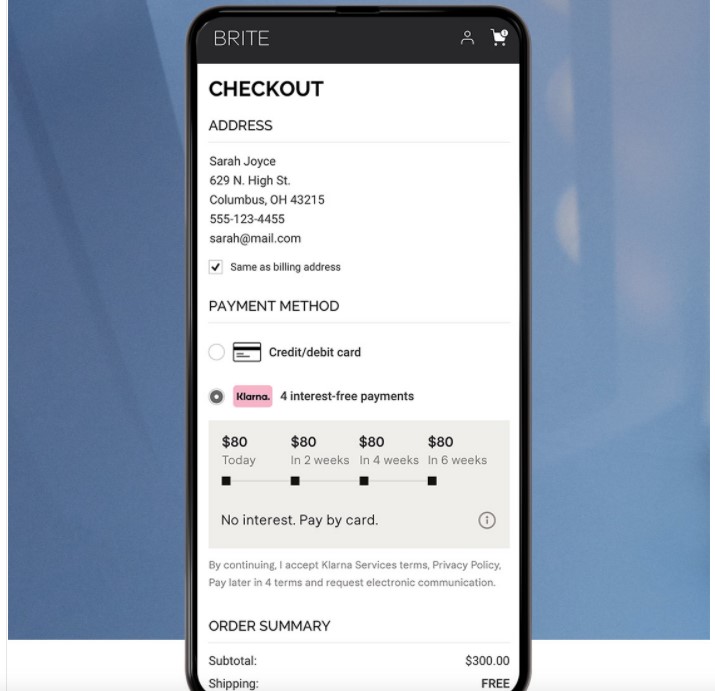
Adding this as a payment method can increase conversion rates by as much as 30% — and increase average order values by as much as 50%[*].
This method is ideal for shoppers who prefer not to use credit cards or who don’t have the funds to pay for a large purchase all at once but will over the next few months. It’s also interest-free in most cases, which provides shoppers with flexibility even if they do have the money to pay right now.
#9. Reduce Risk for Your Customers
One reason visitors leave without converting, especially in eCommerce, is that they’re not sure if they’ll like your product.
If you think this is a minor problem, think again.
World-class direct to consumer brands like Warby Parker identified it as such a big opportunity that they even ship frames to their customers for free pre-purchase so they can try them on:
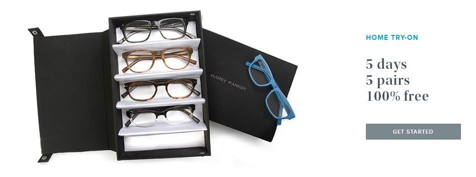
Without a tangible product that they can touch and experience in person, it’s crucial to ensure your visitors feel comfortable enough in your products to convert.
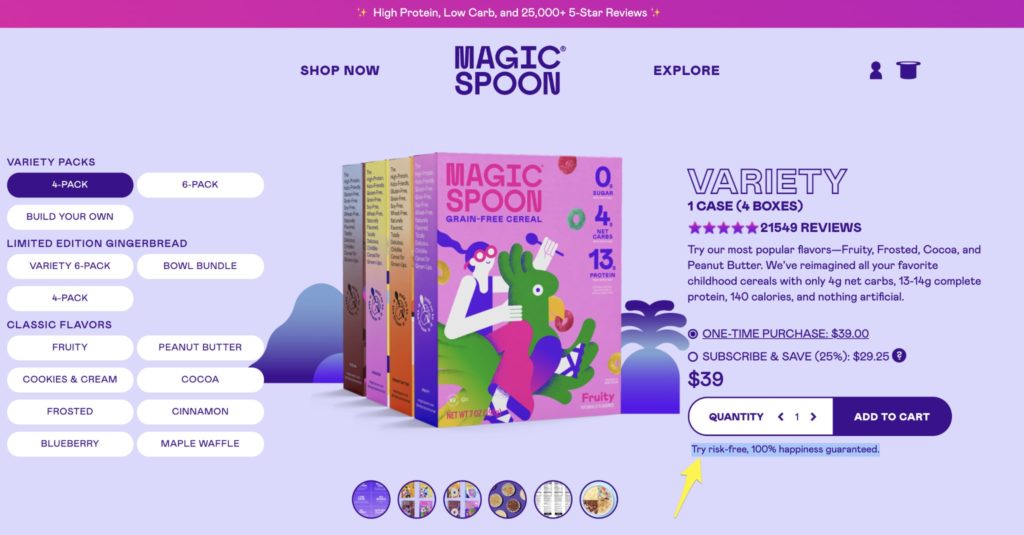
Your team doesn’t have to develop an entire app Warby Parker-style, though. Often, a simple money-back guarantee makes customers feel more secure in making a purchase.
Even better, offering free returns removes most of the risk for online shoppers. Most customers will never take advantage of it, but a solid risk-free guarantee can mean the difference between winning the conversion and losing it.
Already have a guarantee? Make sure your customers know about it, by communicating it liberally on your eCommerce site.
Check out how Magic Spoon adds a layer of security by reminding users of their guarantee right below the “risky” Add to Cart button.
#10. Implement Multiple Customer Touchpoints
One challenge of eCommerce is the lack of hands-on customer support that you can provide easily at a brick-and-mortar store.
Because of this, many customer questions go unanswered (and unasked!), and visitors don’t benefit from the reassurance that they will be taken care of if something happens or they experience a problem.
This is why ensuring that you have multiple methods of communication and support avenues is often a conversion rate booster. Consider implementing the following.
Test Out Live Chat
As users navigate your site, questions inevitably pop up. They may wonder about your shipping times or your return policy. Or they could want to know if your products fit true to size, or what ingredients are in a specific item.
And the truth is that even if your team has worked hard to set up the most comprehensive FAQ page possible, most users won’t bother visiting it.
Most users, when faced with an unanswered question about your products or policies, will simply leave… without converting.
So giving customers the ability to quickly ask a question or find an answer to a question (yes, even a frequently asked question!) without having to navigate off the page they are already on is good business.
This is the power of live chat.
Check out how Four Sigmatic displays an ever-present chat bubble at the corner of the screen:
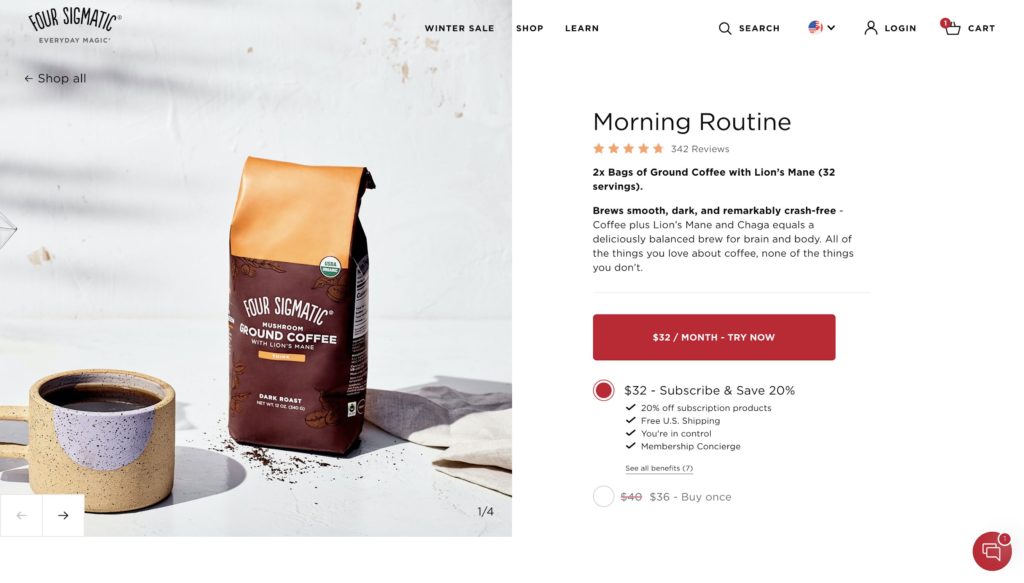
So if anything comes up while visitors are browsing, they can have their questions answered and move on to the important thing: converting.
Prominently Display Your Support Phone Number
At one company I previously consulted with, we tested communicating the customer support phone number across multiple stages of our checkout funnel. We added it on the product page, to the cart page, and to the checkout.
The version with the customer service phone number added increased conversion rate by around 10%. Interestingly, it seems as though just knowing the phone number existed was enough to convert more visitors; there was no noticeable increase in the velocity of support calls.
If you have a customer service phone number, consider communicating it judiciously.
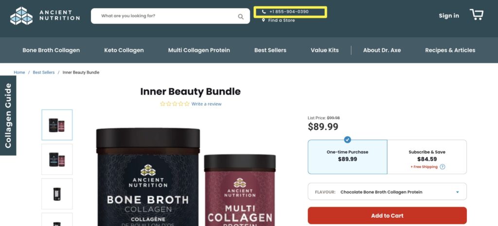
The supplement brand Ancient Nutrition communicates their support number on their site header:
As well as in multiple places throughout the customer experience, including on the checkout page.
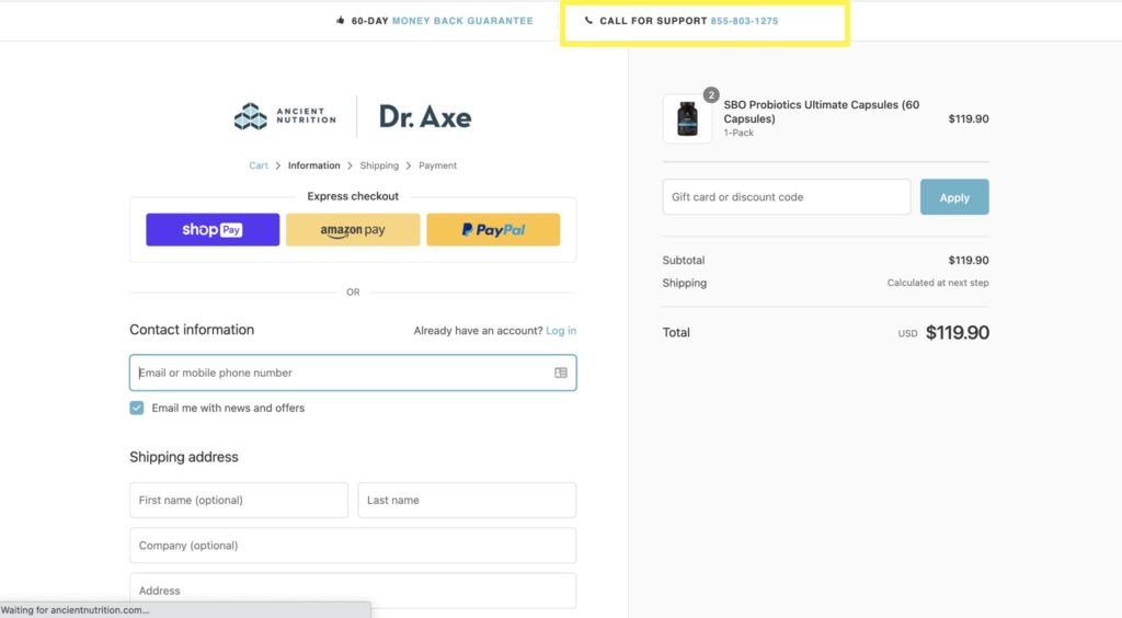
This acts as a trust signal, making customers feel more secure in placing an order. They have an easy way to contact your team if something goes wrong with their order.
#11. Tap Into the Power of Social Proof
The psycho-social phenomenon of social proof is a well-known term and one that you’re undoubtedly familiar with.
So while leveraging your brand’s social proof isn’t quite an advanced conversion rate optimization strategy anymore, it is a tried and true one and one that has longevity. It has worked to explain consumer behavior and drive conversions since the 1980s when the concept was popularized, and it still works today.
But now, social proof not only continues to be effective, but it is also easier than ever to gather, implement, and test. This is why it’s so baffling that so many established brands fail to tap into its magical powers.
Review the important, transactional pages on your website, such as your product, collections, landing, cart, checkout, and home pages. Is each page leveraging all of the social proof it can?
Don’t just focus on only one type of social proof, either. There are plenty of different ways to establish social proof in eCommerce, including:
- Product reviews
- Brand reviews
- Press accolades
- Media mentions
- “As Seen In” logos
- User-generated content
- Customer testimonials
- Case studies
- Before and after pictures
- Recent transactions and site visitors
- Number of followers, subscribers, or customers
- Awards, certifications, nominations.
Social proof drives customers to convert by establishing trust and providing reassurance that they’re not the only one on your brand’s bandwagon.
And while many teams shy away from leveraging its power to its full potential because they’re afraid of overdoing it, it’s surprisingly difficult to over-prove your brand and product’s legitimacy.
Not convinced you need additional social proof on your website to increase conversions? A/B test adding another bragging right to the key pages in your onsite conversion funnel.
I ran a quick A/B test where I swapped a value proposition on one of my company’s product pages with a quoted customer review:
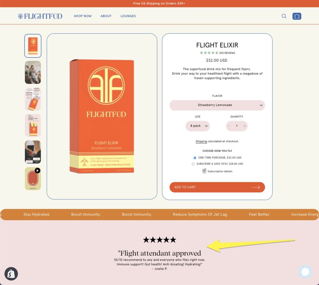
And this one minor update led to an increase in conversion rate of over 75% for the segment I tested it on.

You just may be sitting on a low-hanging fruit that can unlock additional conversions.
There’s No Easy Answer to eCommerce Conversion Rate Optimization
The eCommerce space is getting more competitive every year. As more users rely on their phones to find and buy the things they want and need, eCommerce stores need to get more creative in the quest to drive conversions.
Increasing conversion rates should start with improving the user experience. Does your site load fast? Is it easy to use? Have you included trust signals? Do you offer the payment options users want?
From there, you’ll have to dig a bit deeper. Use A/B or multivariate testing to test a few of the strategies above. You might find that increasing your conversion rates is easier than you expect.


