Bonus material: Prioritization Matrix
69% of online shoppers who add products to their carts leave before completing their orders.
Cart abandonment has many damaging effects for eCommerce stores: it skews data, reduces conversion rates, drives up customer acquisition costs, and more.
The most effective way to tackle this problem is by reducing cart abandonment rates at the source, by taking proactive measures to drive fewer of your customers away after they’ve put items in their carts.
This guide is the exhaustive list of every single strategy to reduce your shopping cart abandonment rate.
Abandoned Cart Rate Reduction vs. Abandoned Cart Recovery
There are many reasons why customers abandon their carts, from distrusting your brand to a clunky user experience and everything in between.
Read More: Here’s Why Your Customers Abandon Their Carts
The factors driving online shoppers away will differ depending on your brand, industry, and the types of customers you attract.
But regardless of the reasons, there are two ways to tackle this problem, and it’s best done with a two-pronged approach:
- Reduce shopping cart abandonment rates by taking proactive measures to drive fewer of your customers away after they’ve put items in their carts.
- Recover abandoned carts by taking reactive action to attract customers back who started the checkout process but never converted.
Cart recovery tactics are popular in eCommerce, and for good reason: some amount of abandoned carts are inevitable, and drawing customers back to complete their order through email remarketing or retargeting ads is an effective way to re-engage those consumers.
But alleviating the number of carts that need to be recovered is your team’s best weapon against fighting cart abandonment.
This is done through a number of measures to reduce cart abandonment rate onsite and in-session.
We’ll get into an exhaustive list of cart abandonment rate strategies below; but before then, it’s important to understand why it’s so crucial that eCommerce brands first address the problem at its source.
Harness the Power of the Pivotal Moment

When your customers are browsing your site and they put an item in their digital shopping cart, this is a pivotal moment in their customer journey.
This is the moment their shopping behaviors switch from communicating an investigative or navigational intent, to a transactional intent.
Read More: Customer Purchase Intention: Definition, Why (+ How) to Measure & Convert
In other words, their purchase propensity accelerates.
By adding products to their digital cart, the customer is picking up speed and gaining momentum.
This is a powerful moment to keep them engaged until they convert. But if instead they abandon their session and leave without completing their purchase from your brand, a few things happen:
- They’ve lost their forward momentum. The pivotal moment has passed, and it’s tough (and expensive) to get it back.
- Their customer journey is interrupted. Even if they intend to return to check out, it’s highly unlikely that they will.
- They are open and susceptible to competitors. Your brand nurtured these cart abandoners’ purchase intention, priming them for conversion. They’re in the market for the products your brand offers; but now that their data communicates intent, their purchase propensity, psychographics, and behavioral analytics can be used by advertising platforms to serve competitor ads to them.
Consider this common consumer strategy to avoid overspending: you’re supposed to take a break from shopping, and if you’re still thinking about the product in a certain amount of hours or days, it means you weren’t impulse shopping and you can go back and buy the item.
That’s because the distance works…for consumers.
It breaks the “yes” wheel, the momentum the shopper was feeling is no longer, and frankly, people are lazy. Returning to a store — even an online store — is probably not going to happen.
By taking proactive measures to reduce cart abandonment rate before it happens, you can improve your conversion rates and reduce your customer acquisition cost.
17+ Advanced Techniques to Reduce Abandoned Cart Rate
These are the proactive strategies to minimize the amount of shopping cart abandonment at the source: onsite.
The lower your cart abandonment rate, the higher your conversion rate, and the fewer carts you must reactively recover.
#1. Improve the Mobile Shopping Experience
72.9% of eCommerce spending happens on a mobile device[*] as of 2021, a number that has grown exponentially since 2016.
And data collected from over 2 billion weekly online shopping sessions across top retailer’s eCommerce stores paints a scary picture of cart abandonment for mobile users.
The cart abandonment rates per device are:
- Mobile: 74%
- Tablet: 62%
- PC: 61%
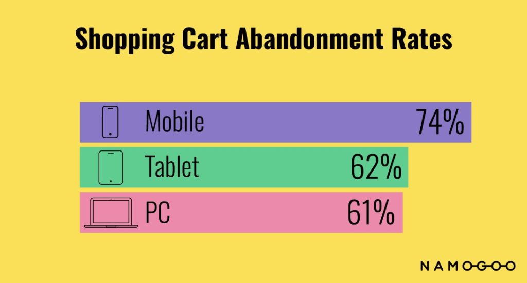
Since mobile cart abandonment rates are so much higher than those of desktop users, improving the mobile experience can go a long way to reduce abandonment rates.
This means going beyond ensuring your online storefront is simply responsive.
Think like a mobile consumer, considering your customer segments and their behaviors, psychographics, and demographics to craft a mobile UX and UI that:
- Removes friction points
- Simplifies the customer journey
- Personalizes the onsite mobile experience.
Read More: 4 Mobile Optimization Tips to Grow Sales
#2. Implement a Minimum Shipping Threshold
In 2021, free shipping is expected online.
Seeing a shipping charge is a driver for why many shoppers abandon their carts, and nearly 80% of consumers cited free shipping as a key factor for their online purchasing decisions[*].
But many brands can’t offer free shipping without eroding eCommerce margins, especially when the average order quantity is only one item:

So one way to reduce cart abandonment rate while protecting your margins is to offer free shipping over a minimum order threshold.
Bonus: this can also help to improve average order value.
Check out how Vital Proteins has a free shipping threshold in their cart.
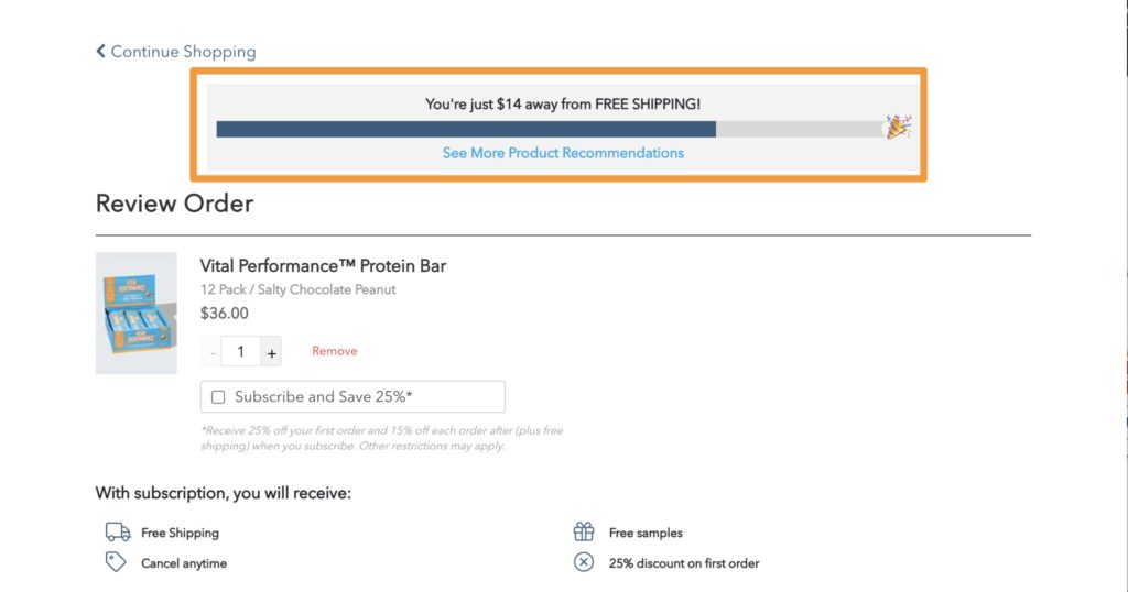
This doesn’t drive the customer away as a surprise shipping charge at checkout might, but incentivizes the customer to continue shopping.
#3. Stop the User in their Tracks With Intent-Based Incentives
Some users are on the fence, and all it takes is a little nudge to convert.
So stopping the user in their tracks when they’re about to abandon their session with an incentive can reduce cart abandonment rates by 20% or more.
You can identify users who are about to abandon their carts and provide them with the minimal promotional offer they need to convert.
This capitalizes on the critical moments of conversion; the moments they’re actively engaged with your brand and have built buyer’s momentum.
You can take this strategy to the next level by offering personalized promotions based on real-time intent, like with Intent-Based Promotions.
Intent-Based Promotions’ AI-driven “brain” considers data-points about customer buying behavior from millions of online shoppers to calculate the purchase propensity and abandonment potential of each visit.
It then autonomously determines the minimum promotion needed to convert (if any), and serves the promotion onsite.
#4. Revisit & Communicate Your Return Policy
One drawback of online shopping is the inability for consumers to try things on, or physically interact with the product.
Humans are tactile creatures, and in the absence of a sensory experience, we want to know that we’re not going to be stuck with something we hate.
Enter: the return policy.
A flexible and generous return policy makes online shoppers feel more secure in their purchase.
It’s understandable; a solid return policy, like a 30-day money-back guarantee, communicates that the brand feels confident in their products, and acts as a security blanket to handle the common “what if I don’t like it” objection.
Most people won’t ever use it, but it helps your visitors continue with their customer journey.
Check out how the vitamin brand Ritual communicates their generous return policy on their cart page:
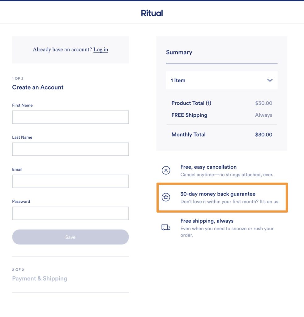
Their 30-day money back guarantee is communicated on the cart and checkout pages, acting as a security feature and making customers feel more comfortable in completing their purchase.
If your return policy is rigid and doesn’t include a guarantee or free returns, consider revisiting it with your customer service team.
If you already have a solid return policy, consider making it more visible at pivotal moments during the user checkout flow to reduce cart abandonment.
#5. Eliminate Friction Points
Friction happens in the UX when a visitor experiences unexpected roadblocks.
These can happen in two ways:
- The user experiences something unexpected in the checkout flow
- The user must jump through too many hoops to complete their order.
This might seem like a overblown problem, but don’t underestimate it;
- Nearly 70% of users won’t complete an online form if there are too many form fields[*]
- More potential customers drop off with every step in the onsite conversion funnel:

The best case scenario is that friction points act as a speed bump, rather than a roadblock. But this is the case only for highly motivated customers, who were always going to buy from you anyway.
This is not the vast majority of online shoppers, so eliminating friction from your checkout flow is important.
#6. Consider a Cart Slider to Reduce Steps in the Purchase Path
The typical conversion path looks something like this:
Product Pages → Add to Cart → Cart Page → Checkout [Shipping Details] [Payment Details]→ Order Complete
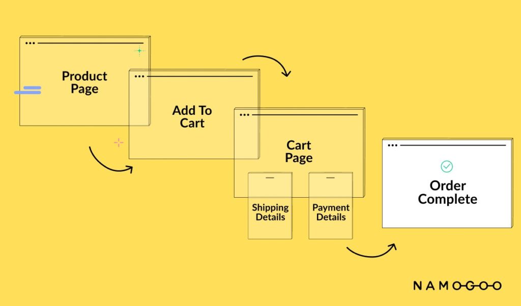
And this is okay for some brands, products, and types of customers. But for others, sending all customers to a standalone cart page adds too much friction to keep customers moving down the conversion funnel.
For these brands, swapping out the standalone cart page in favor of a cart drawer (also known as a cart slider) provides a better shopping experience as users can review their cart summary without adding another step to the checkout flow.
Here’s how a cart slider works:
This is a strategy we recommend testing before implementing. Depending on your brand’s target customer, sometimes a cart drawer doesn’t work.
In my past roles as SVP of eCommerce and VP of Marketing for high-growth eCommerce brands, I tested the cart flow with interesting results.
With one brand, my team A/B tested sending customers to a cart page from the slider (control), vs directly to the checkout (variation). Interestingly, the control resulted in almost a 10% reduction in abandonment rates when compared to the variation, suggesting that the customers wanted the opportunity to more thoroughly review their cart contents before checking out.
With another brand, we A/B tested the cart functionality to see whether a cart slider on the homepage (variation) would improve conversion rates over the control, which was a standalone cart page (control). In this case, the variation resulted in a 7% conversion lift compared to the control. This suggested that the slider provided a better UX for convenience and decisive customers who add to cart as they know exactly what they want.
These conflicting results make sense because I tested them on different brands, in different niches with different target customers.
Implementing a cart slider might work for your brand if you have:
- A limited number of skus
- Decisive shoppers like the Go-Getter type of customers.
- Products that only require quick decisions.
The only way you’ll find out for sure is if you test it!
#7. Make Customers Feel Secure by Adding Trust Signals to the Checkout Flow
One factor that drives your visitors to abandon their carts is lack of trust.
The customer wants to buy, but isn’t sure if they trust your company or the product they are considering.
That’s because reviews are a trust signal; they communicate to the buyer that your brand is established, and that others have purchased from it.
Reviews are not the only trust signal, though. Consider using:
- Trusted payment processors, like Paypal or Amazon Pay
- Money-back guarantee or solid return policies.
- Security badges
- Customer service contact information.
Even just updating the cart button copy to Secure Checkout can be enough to provide customers with an extra layer of reassurance:
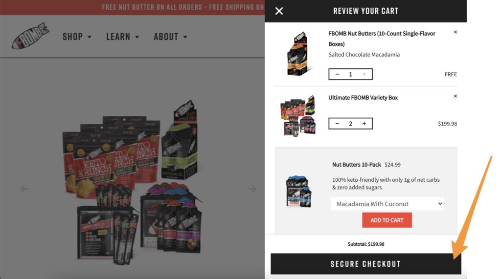
Don’t leave it just to the cart, though. Bring these security features through to the checkout process to act as a reminder.
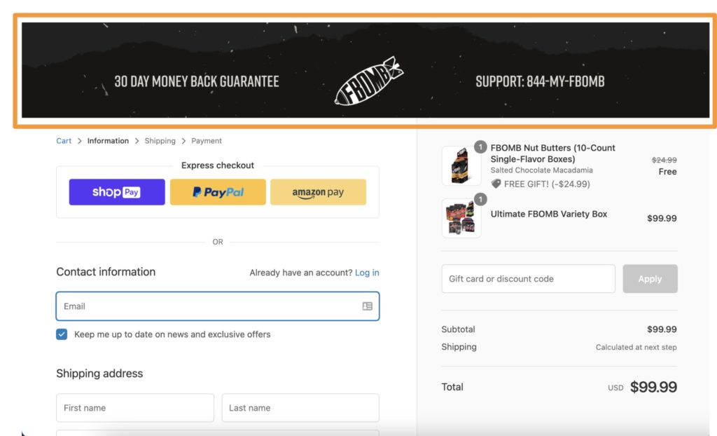
Be careful of going overboard with security features. Cluttering your cart page can interfere with your UX, especially on mobile.
Certain customer segments are more likely to be wary of online shopping than others, so rely on your buyer personas and knowledge of your customer’s psychographics to implement the right mix.
It’s worthwhile to test communicating different trust signals in your checkout flow to find the minimum viable outcome — what your customers need to feel secure in completing their orders.
Read More: Psychographic Segmentation in 2021: Definition, Benefits, & Types
#8. Lessen Confusion by Improving Cart UX
Whether you implement a slider or keep the cart page, improving the UX on the cart experience can help to reduce cart abandonment rates significantly.
When I’ve specifically asked why customers didn’t complete their orders, the results were surprising:
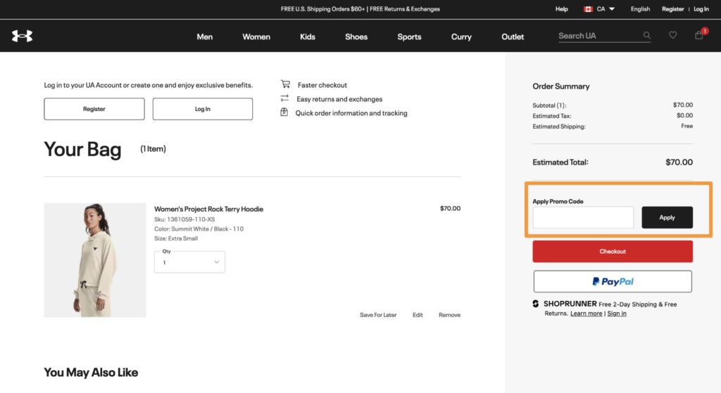
- 4% of customers surveyed didn’t know where to enter their coupon codes
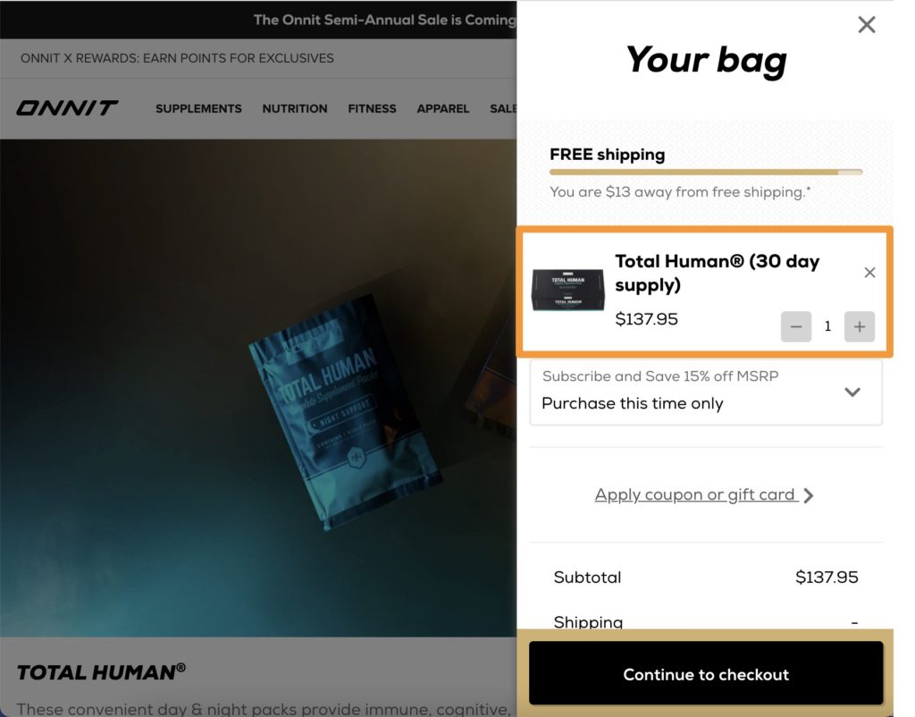
- 3% of customers added items to their carts but were unclear on details of the quantities of the product.
These may not seem like particularly high numbers, but assuming I surveyed a solid random sample, we can expect those who didn’t provide feedback to respond similarly.
A cumulative 7% of all cart abandoners is a massive problem with simple, easy-to-implement solutions. We:
- Included a place for discount codes right on the cart page (rather than in the checkout like the default Shopify capability). Check out how Under Armour does this on their cart page:
- Made sure that the quantities in each package were in the product description that made it into the cart. See how Onnit does this in their slider:
Your customers may have different feedback based on your eCommerce store’s UX.
Asking a random sample of recent cart abandoners what prevented them from checking out can provide extremely useful data on things that your team may have overlooked.
You can then use that information to improve the user experience on your cart page to reduce abandonment rates (and the frustration felt by your customers).
#9. Trigger Scarcity and Urgency to Improve Same-Session Conversions
Some of the oldest tricks in the book, scarcity and urgency are so often used because they’re effective.
But you don’t have to leave these FOMO-inducing tactics to just your sales promotions. Experiment with triggering scarcity and urgency to reduce abandoned cart rate, too.
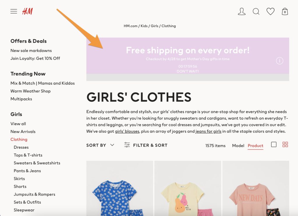
H&M triggers urgency not only on the product and category pages:
But also on their mobile cart page:
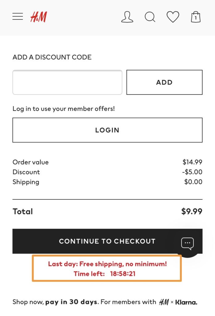
In my previous role as the VP of Marketing for a high-growth eCommerce brand, my team A/B tested installing a countdown timer to trigger urgency to get a welcome discount, like the H&M example above.
The variation with the timer outperformed the control significantly, resulting in a 31% lift in transactions, which translated into several million dollars in incremental revenue.
Don’t want to do this with a discount or promotion? There are other ways to achieve a similar result.
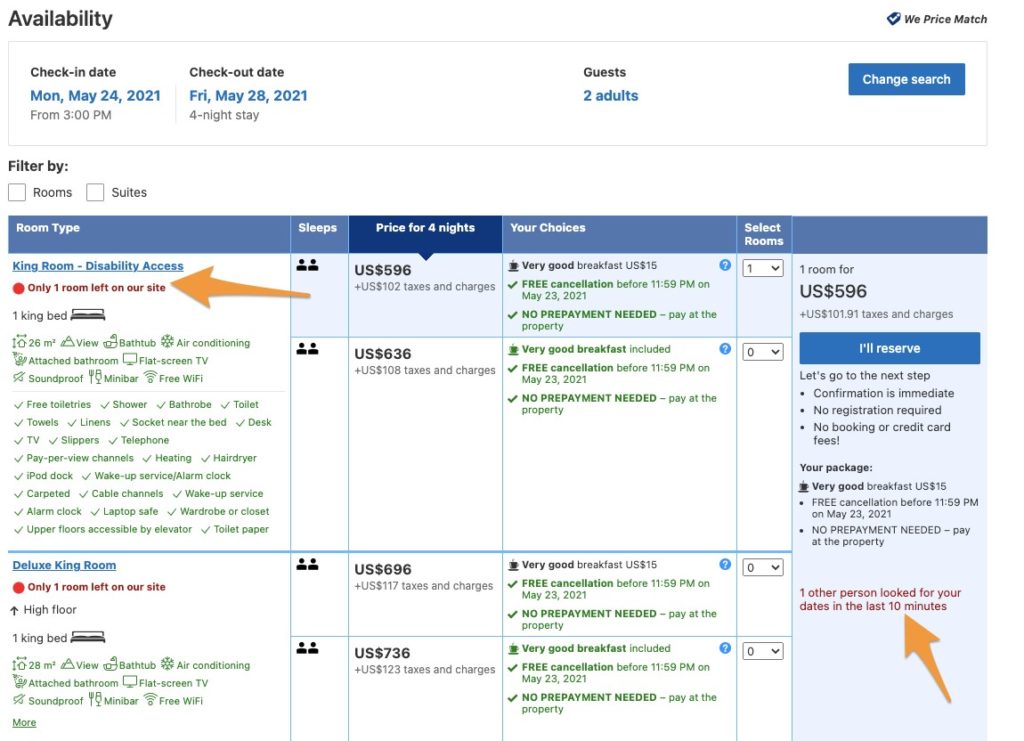
Trigger scarcity through communicating inventory limitations, like Booking.com does:
Or, elicit urgency through delivery times. Check out how Cabela’s does this by communicating when the customer needs to check out to receive the order by a specific date.
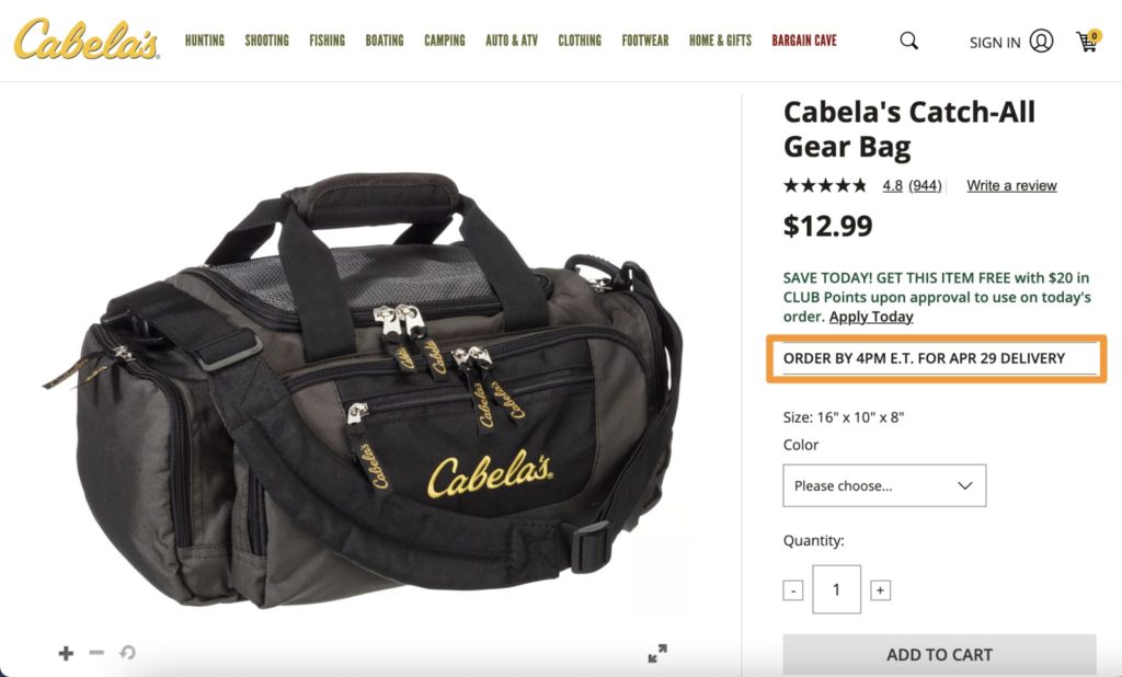
This strategy does double duty in reducing cart abandonment onsite by pairing urgency with offering expedited delivery options.
#10. Eliminate Customer Journey Interruptions
Customer journey Interruptions occur due to the fact that shoppers install and use a variety of browser extensions to find coupons and compare prices as well as other free apps and services, which might cause them to abandon their carts.
Namogoo’s consumer data indicates that this affects between 15%-25% of online shopping sessions throughout the year. Customer journey interruptions are a much bigger problem than most eCommerce teams realize (if they’re even aware of it at all!).
In 2020, eCommerce retailers who eliminated ad injections alone reduced abandonment rates by:
- Almost 25% on mobile
- 19% on desktop.
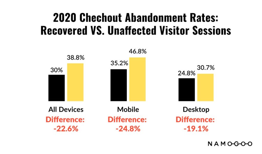
Not only does customer journey interruptions increase abandoned carts, but also ruin the customer’s experience on your site.
There goes the hard work you put into fine-tuning your checkout UX.
That’s why Namogoo developed its flagship product, Customer Hijacking Prevention. It has helped hundreds of the world’s top online retailers eliminate these interruptions from their customer journey, resulting in improved conversion rates, reduced cart abandonment, and more.
Read More: The State of Customer Journey Hijacking
#11. Keep Customers on the Conversion Path with Live Chat
We discussed the pivotal moment earlier, and how crucial this moment is for your customers.
And if customers have to navigate off the page, or email customer service to have a question answered before they convert, you’re killing that moment.
You want to harness the forward-momentum, and convert in the same session.
That’s why customer service enhancements like live chat for instant troubleshooting work so well to not only increase conversion rates, but reduce cart abandonment and even increase average order value.
One study done by Forrester found that live chat results in a:
- 48% increase in revenue
- 40% improvement in conversion rates.
This makes sense. If your customer service team is there when your customers have questions, experience issues, or present objections, they can be solved in the same session. Your customers can preserve their forward momentum instead of leaving to seek answers elsewhere.
Implementing instant messaging sitewide is clearly the best case scenario.
But if that’s not possible or it would clutter the UI, consider implementing live chat just in the checkout funnel to reduce abandonment like Warby Parker does:
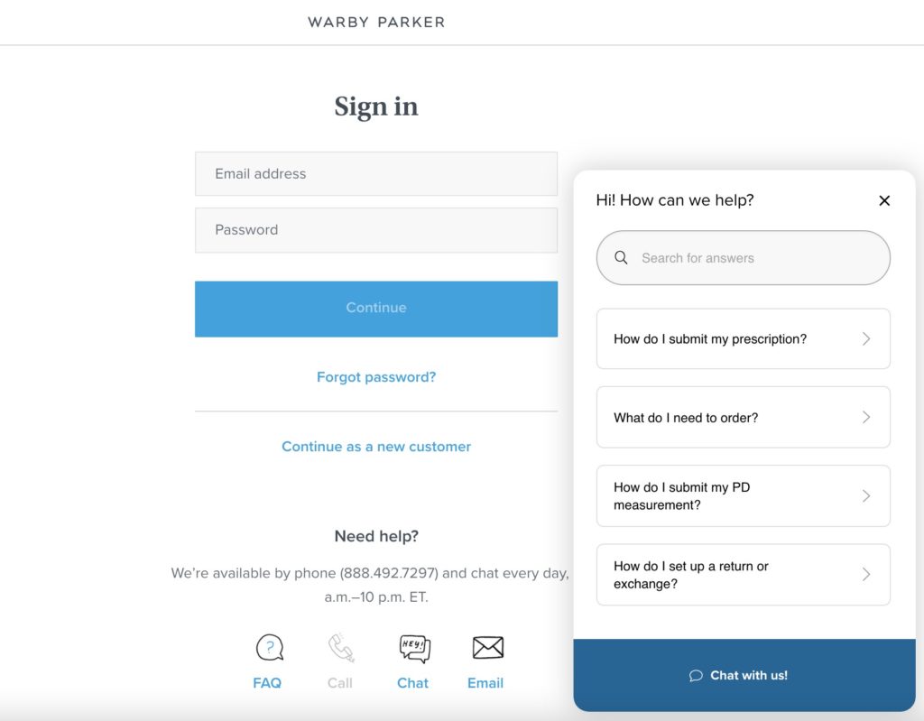
Warby Parker also provides a FAQ option to reduce the time lapse between when the customer has a question and it’s sufficiently answered.
Instant messaging via live chat acts as a security feature, keeps customers on the conversion track and gives your brand an extra layer of legitimacy.
#12. Use Social Proof to Entice Shoppers to Complete Their Orders
Social proof is the pop-psychology phenomenon whereby people look to others behaviors to decide how to act.
If you’ve ever chosen a restaurant, cafe, or bar based on how busy it is, you’ve fallen victim to social proof.
Seeing that a particular spot drew a crowd activates a mental model in your brain that assumes that the spot must be good if so many others are there.
eCommerce teams can activate the same process in their online shopper’s minds by publicizing the “crowd” that they attract.
You can do this on the entire website with an app like Proof:

Or on the cart, product, or checkout pages. Check out how John Lewis does this by communicating view counts:
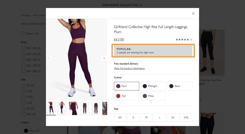
Not only does providing social proof help make shoppers feel more secure by acting as a trust signal (thereby reducing abandonment rate), it also triggers urgency and scarcity.
If you don’t check out now, those 5 people who are viewing the product might snap them all up and you’ll miss out!
#13. Streamline the Checkout UX
A clunky checkout experience drives customers away.
User experience is crucial to conversion rates. Making sure your eCommerce storefront load speed is fast and the site is easy to use can help reduce abandoned carts.
But don’t just focus on site UX — make sure the checkout process is as smooth as possible, too. Here are a few tips to improve checkout UX:
- Only ask for information you need: Reducing form fields makes it easier and faster for customers to complete their purchase.
- Offer a guest checkout: This lets people control how much information they share and can make the process easier. Especially since most phones and computers autofill common information like payment information and shipping addresses.
- Make sure your cart is intuitive: When customers are ready to check out, do they know what to do next? Make your cart easy to find and reduce the number of clicks to checkout.
- Don’t use clever language or hide CTAs: Use clear, direct language for buttons. For example, use “Buy Now” not “Get this today” or “Add to Cart” rather than “Give it to me!” Clever copy might help you connect with buyers, but it can also derail the checkout process.
Implementing quick buy buttons, pre-filled form fields, and express checkout options like GPay, Shop Pay, and PayPal can make the process seamless.
Don’t forget to consider both mobile and desktop users. Your goal should be to make checking out as easy as possible no matter what device customers use.
#14. Avoid Sticker Shock by Offering Payment Plans
We’ve all been there.
You’re browsing your favorite online store, adding items to your cart. But when you click onto your cart page to review it, you realize you went a little click-crazy with that “Quick Add” button.
A high cart value is great for you as the retailer, but it leads to sticker shock for the consumer, causing many abandoned sessions.
Offering interest-free payment plans can solve this. Check out how Outdoor Voices offers the option to pay via installments on their cart page:
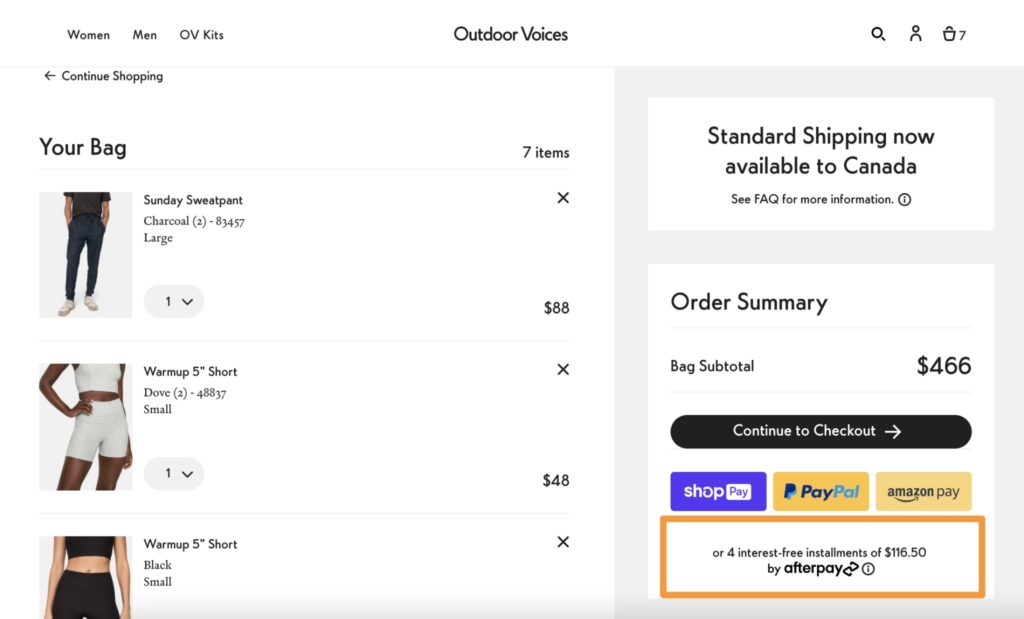
This makes completing the order easier to digest, and your customers are less likely to leave their baskets behind for fear of wracking up their credit card bill.
#15. Provide Expedited Delivery Options
In the era of 2-day Prime delivery, it’s expected that we can get our online orders almost in real time.
Who hasn’t abandoned their online shopping session after seeing a delivery delay? I just abandoned my Amazon cart this morning after seeing a delivery date that was 2 weeks away:
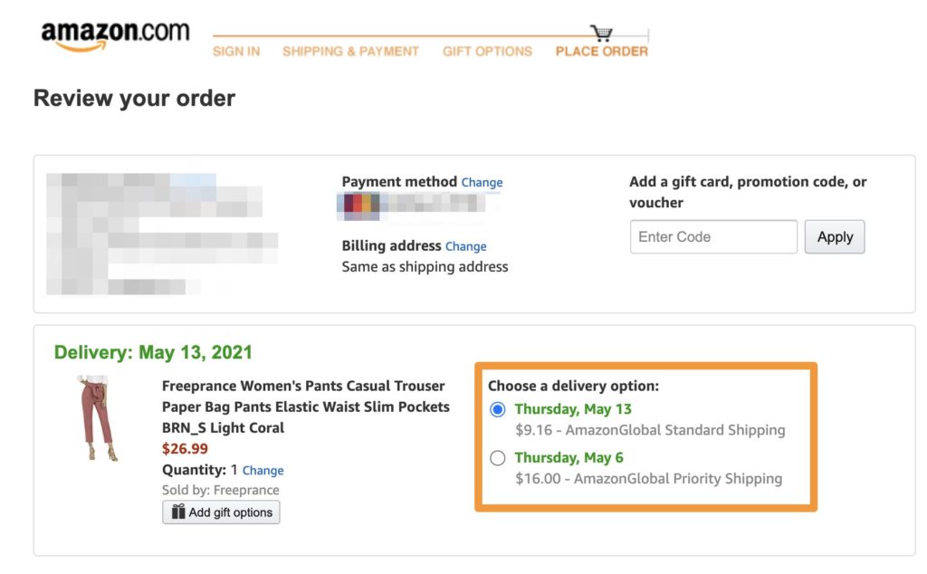
To reduce shopping cart abandonment and address this issue, allow customers to complete their order online and pick up in a retail location, or provide expedited delivery options.
Check out how Lululemon does this and communicates it as a value proposition:
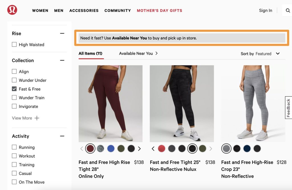
This is especially valuable for brands that:
- Offer products that are often purchased as gifts
- Reach a young target demographic
- Offer CPG products.
#16. Speed Up the Transaction by Offering Express Checkout
The tedious task of typing out your credit card number, especially on mobile or for those types of customers who are single-minded in nature can be a major hurdle.
This is one of the biggest reason why abandonment happens at the checkout stage; customers browsing on their mobile devices during their commute or while waiting in line at the bank don’t always have the patience (or time) to go through a multi-step process to complete their order.
Automatically identifying those who have an account and providing quick-pay options can be an effective way to reduce cart abandonment rate.
Brands that use Shopify can employ behavioral segmentation to expedite the order process with the Quick Checkout function, thereby reducing abandonment.

If you can’t offer express checkout, try communicating how much (or little) time checkout will take.
For example, Namogoo customer Travelocity is clear on their “cart” (or booking) page that booking only takes 2 minutes.
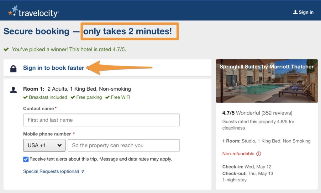
This provides assurance to customers who are short on time, and sometimes that’s all that is needed to get the order over the finish line.
#17. Make the Purchase More Appealing by Offering Add-On Items
Sometimes, customers don’t abandon their carts because of a problem with the UX or a lack of security features.
Sometimes they abandon carts because upon review, their would-be order wasn’t appealing enough.
That’s where this strategy comes into play: making your customers’ order more enticing by offering add-on items, cross-selling in the cart, or even adding personalized product recommendations.
Check out how one of Namogoo’s customers, Crocs, uses behavioral segmentation to provide relevant add-ons to the specific products in cart.
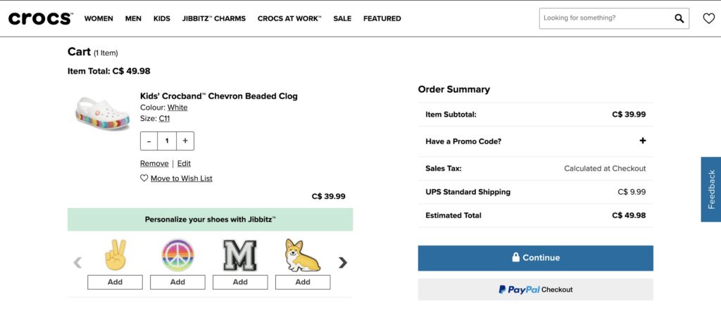
Yes, believe it or not, this average order value-boosting strategy can also improve your cart abandonment rates because it:
- Personalizes the customer experience through product recommendations based on the shopper’s individual buying behavior.
- Reduces friction by reducing the need for the customer to leave their cart and spend time continuing to scroll through collection pages for what they’re searching for.
- Makes their basket more appealing to them.
Read More: Average Order Value: The Advanced Guide
Implement These Cart Abandonment Strategies Today
There are a lot of techniques in this guide to reduce shopping cart abandonment rate onsite. The factors driving online shoppers away will differ depending on your brand, industry, and the types of customers and customer segments you attract.
Deciding on which strategies to start with should come from your buyer personas.
- Look to your customer psychographics to form hypotheses about what motivates your customers and what is important to them.
- Consider the demographic segments your brand reaches to tailor the onsite experience to them.
- Dig into your onsite behavioral data to see where customers are falling off.
Abandoned carts are an inevitable fact of eCommerce. After you’ve built reduction strategies into your eCommerce team’s development, CRO, or A/B testing pipeline, focusing on cart recovery is the next step.


