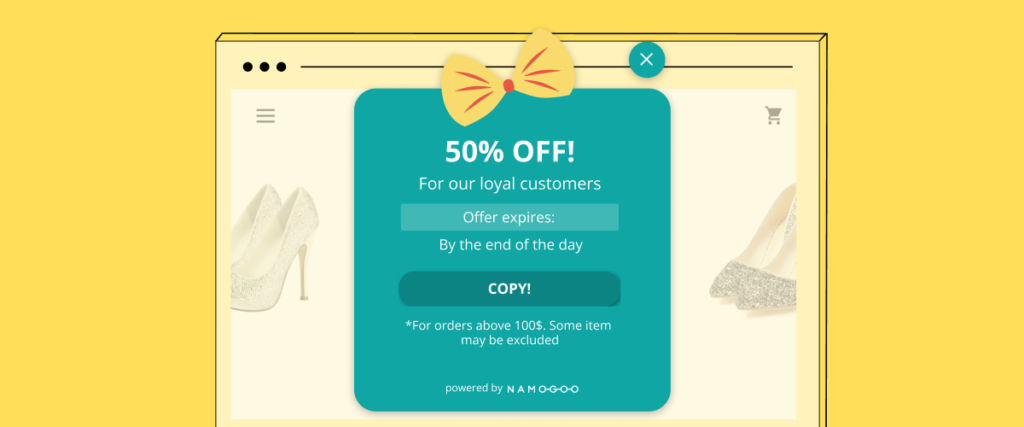
Pop-ups have a bad reputation, and it’s easy to see why; too many websites use pop-ups indiscriminately in an effort to drive conversions.
But when leveraged strategically, pop-up marketing can drive conversions, reduce cart abandonment and actually improve your onsite customer experience.
In fact, the top 10% of pop-ups have an average conversion rate of over 9%[*].
So in this article, we’ll cover the dangers of misusing website pop-ups, and provide you with eight pop-up advertising best practices to harness their full potential.
3 Dangers of Misusing Pop-ups on Your eCommerce Site
Pop-Up Advertising Best Practices to Drive Conversions
Drive Conversions and Loyalty with These Pop-up Marketing Best-Practices
3 Dangers of Misusing Pop-ups on Your eCommerce Site
Whether you love ‘em or hate ‘em, pop-ups clearly have benefits.
They can help eCommerce teams drive sales, increase email subscribers, and personalize the onsite experience for customers.
However, pop-ups can cause major issues if you don’t use them properly.
Poorly-implemented pop-ups can annoy your customers — and annoyed customers are less likely to covert. But other issues can have a long-term impact on your website, revenue, and overall success of your eCommerce channel.
The three biggest dangers of misusing pop-up ads are:
1. Increase Your Site’s Bounce Rates
We’ve all experienced it:
You land on a website and are served a pop-up that takes over the experience completely. Worse yet, it’s impossible to exit out of. So what do you do?
You leave and you find another site to help you.
When pop-ups cover the page or are hard to exit out of (especially on a mobile device), or appear at the wrong time, visitors are unlikely to stick around to troubleshoot. So they hit that back button and move on to one of your competitors.
The higher your bounce rate, the fewer customers you can convert.
2. Damage Search Engine Visibility
In 2016, Google released an algorithm update that cracked down on what they call “intrusive interstitials[*].”
Intrusive interstitials, such as pop-ups and dialog boxes that cover the content on the page can harm the user experience. Google’s decision to devalue pages that use interstitials is meant to protect their own user experience with Google search.
If a user lands on a page they can’t properly navigate due to an interstitial blocking the page content or making it annoying for the user to find what they’re looking for, it’s less likely that their search query will be satisfied.
So if you use pop-ups indiscriminately, Google may devalue your results in favor of results with a better UX, which may result in less organic traffic.
This is not to say that using pop-ups will definitely hurt your SEO. In fact, the majority of top eCommerce stores, including our customers, use pop-ups strategically without damaging their search engine visibility.
We’ll show you how to avoid this later on in this article so you can create an optimized onsite experience that doesn’t lead to your site being penalized by Google’s algorithms.
3. Degrade Your Brand Perception
Pop-ups can drive email subscribers, increase average order value, personalize the online shipping experience, and drive customer engagement.
But when they’re not used properly, they can harm the way your customers and prospects view your brand.
After all, poorly timed, badly designed or pushy pop-ups scream “spam!” to most consumers. And if consumers view your brand as desperate or spammy, they won’t trust you, and they certainly won’t perceive your brand favorably.
Download: Emotional Shopping: Customer Perceived Value & 6 Ways to Improve It
Pop-Up Advertising Best Practices to Drive Conversions
Now that we’ve covered the issues pop-ups can cause for eCommerce brands, let’s talk about how to get them right.
Here are nine eCommerce pop-up strategies to help increase conversions and sales.
#1. Incentivize Your Pop-Up Call to Action
In 2016, the web users visited on average 94 websites per day[*].
If even 20% of those websites served a pop-up, your visitors will have seen nearly 20 pop-ups every single day.
Add that to the fact that consumers are exposed to around 5,000 advertisements each and every day[*], and it’s safe to say that there’s stiff competition vying for your audience’s attention.
So how do you convince your online shoppers that your call to action is worthwhile?
By offering an incentive.
It’s not enough anymore to expect users to subscribe for updates. If you want to drive conversions with pop-up marketing, providing customers with an incentive to take your call to action is a must.
Your visitors are already on your site. They’re interested in something you have to offer, so providing an incentive not only encourages visitors to take action, but it’s also attention-grabbing. The right offer can help capture attention before visitors exit out of your pop-up almost automatically.
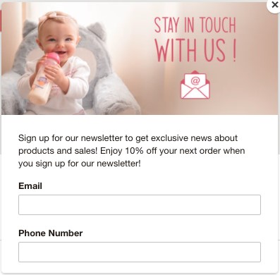
Take a look at the differences between these two pop-ups:
1. This pop-up from the popular child & baby brand, Nuby:
2. Nearly the same pop-up, but offering an incentive to sign up:
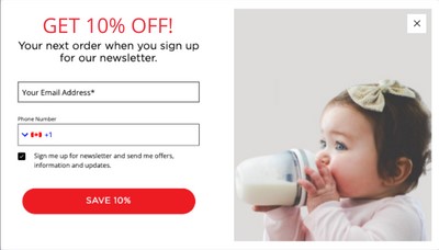
Which do you think would garnish a higher conversion rate?
Common eCommerce pop-up incentives include:
- A discount code
- Spin to win
- Free shipping over X amount
- Buy X, Get Y
- Free gift with a purchase
- A free eBook, guide, or digital download.
Not all incentives are made equal, and they won’t convert at the same rate – especially for all traffic sources and brands.
For example, Sumo found that incentivizing sign-ups with a discount code converted 30% better than an offer for an eBook[*].
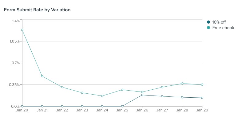
But when I’ve run similar experiments on my eCommerce store, offering an eBook improved form submission conversion rates by 156% for blog visitors compared to a 10% off coupon:
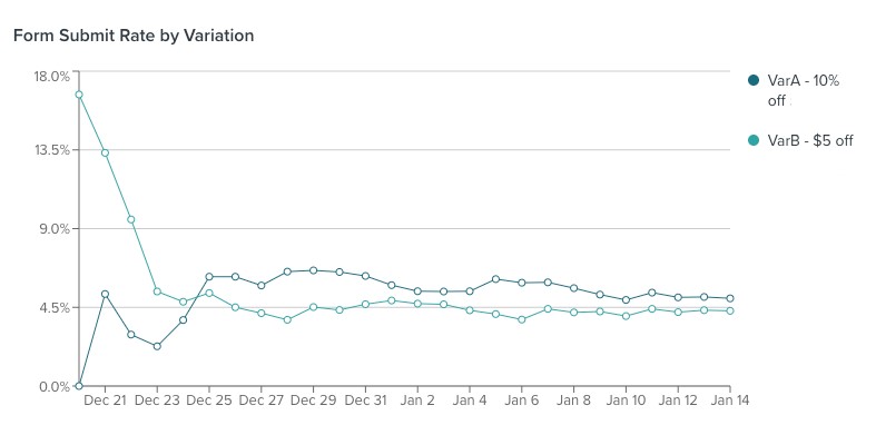
And positioning the discount as a percentage off instead of a dollar amount improved conversions for Facebook ad traffic by 17%.
The incentive that will perform best for your brand depends on your products, the types of customers you attract, and your customer’s purchase intention.
Test a variety of offers on different audience segments to find the incentive that works best to convert your visitors.
Or, fast-track nailing down the right incentive by offering personalized incentives tailored to each user with Intent-Based Promotions.
#2. Drive Conversions Through Personalized Pop-ups
Personalized marketing helps show customers you understand who they are and what they like.
And it’s also a powerful strategy to drive sales, conversions, and revenue.
In fact, 61% of online shoppers surveyed for Namogoo’s 2021 eCommerce Promotions Insights Survey said they’re more likely to buy after a personalized experience with a brand.
Personalized experiences delight shoppers and allow you to tailor the call to action, messaging, and offer to increase conversions or average order value.
For example, check out how Roma Designer Jewelry serves personalized, dynamic upsell pop-ups based on what the user has in their cart:
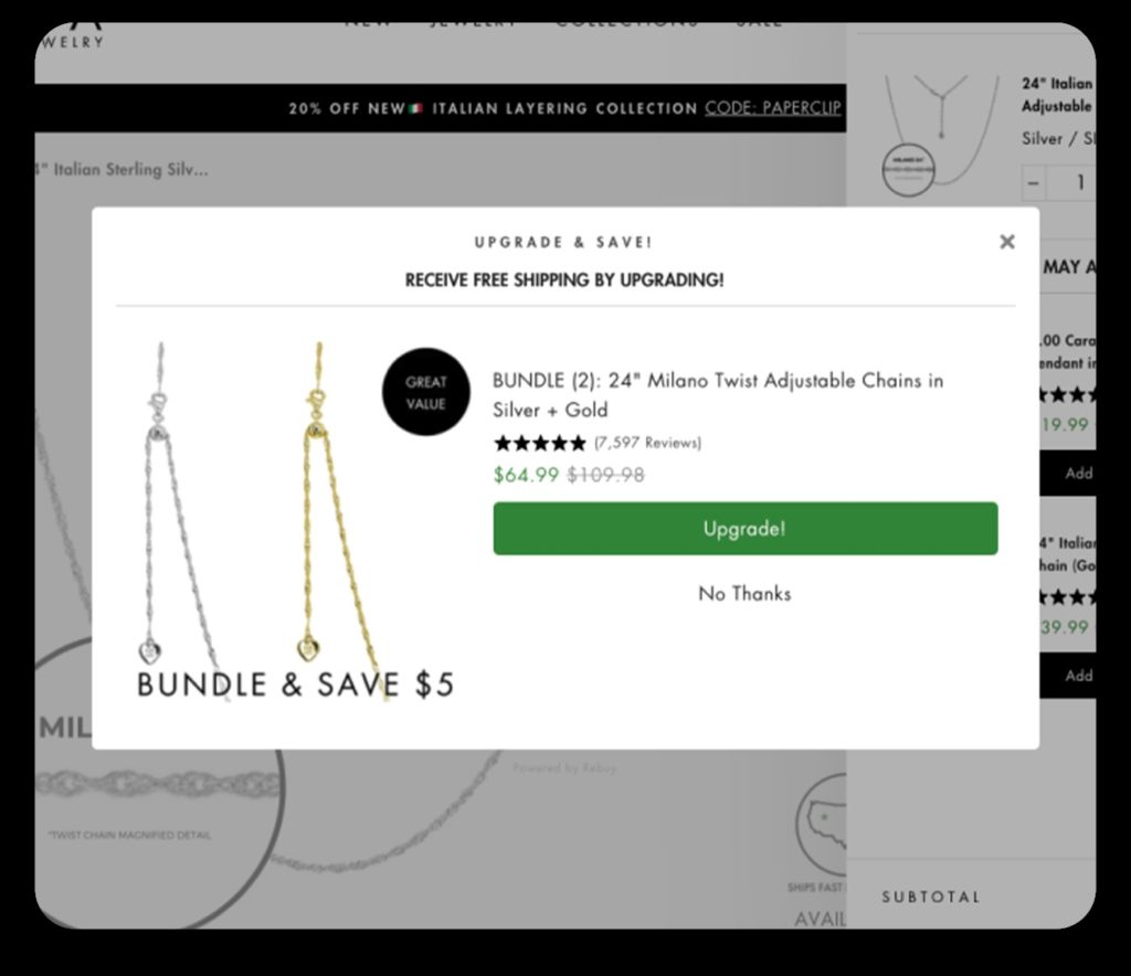
In this example, the user was already adding items to their cart, and serving them with a generic discount offer or an email capture form would have interrupted the user experience.
But by pairing the product they had in their cart with a complementary product and offering a $5 discount to upgrade, Roma encourages increased cart value without distracting the almost-customer from their conversion path.
You can also use pop-ups to recover abandoned carts or recommend products related to their browsing history using behavioral data.
Personalization can also help brands with multiple target audiences. Say you offer products for both kids and teens. Rather than showing teens examples of kid clothing, you can show teens styles and products that appeal to them.
#3. Serve the Most Relevant Pop-Ups to Each Audience Segment
One common pop-up mistake that can have a dramatic impact on how well your pop-up performs is implementing a blanket pop-up that shows to everyone regardless of the customer segment each visitor belongs to.
Instead of serving the exact same pop-up to all of your visitors, tailor your pop-ups to your audience segments in different stages of the onsite journey based on the best experience for each type of customer.
If you’re using Intent-Based Promotions, you can tailor your audience for each campaign under Define Campaign Settings.
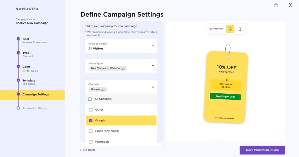
Intent-Based Promotions’ decision engine will automatically personalize the discount to the offer that’s most likely to drive each individual to convert within the parameters you set.
If you’re not using Intent-Based Promotions, you should still be able to adjust the audience targeting of your pop-up campaigns. Most other eCommerce pop-up apps allow audience targeting in a section called Settings, Audience, Targeting, or something of that nature.
Audience-based targeting takes into account the visitor type, device, referring channel, and geography of your traffic segments.
Remember: these factors can influence user behavior so heavily, so serving a different pop-up experience based on these factors can improve your conversion rate drastically. Let’s take a look at each type of audience-based display targeting to understand how they each have an impact:
- Type of visitor: New visitors just learning about your brand may respond to a different pop-up than returning visitors. Displaying a specific experience that establishes trust and authority and offers a free lead magnet may be more effective than offering a discount on a product for new visitors.
Create conversion segments in Google Analytics and explore different reports to identify opportunities for tailoring your pop-up to new vs returning users. For example, on my Shopify store, returning visitors who haven’t yet made a purchase are 7x more likely to add a product to their carts than new visitors.
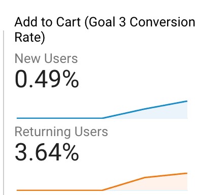
I might use this data to tailor my pop-up to include more education, trust signals, or brand elements to nurture new visitors more.
- Device: The experience you offer visitors browsing on different devices will impact their likelihood of converting, because of the nature of each device. You may be successful in serving an exit intent pop-up for desktop users but for mobile devices where it’s difficult to infer the intention to abandon a session, it falls flat.
It’s typical for desktop pop-ups to perform better than mobile. It’s a better user experience on desktop and it’s easier to follow through on a call to action. In fact, a basic lead capture pop-up one of my former clients was running garnished double the form submit rate on desktop than on mobile.

But by tailoring your pop-ups to each device type, you can maximize conversions on both devices.
- Channels: The source of each session influences how the user interacts with your website. For example, visitors referred to your online store by an affiliate may respond to a pop-up that appears shortly after they start their session because they have the affiliate’s stamp of approval and they may be more primed for conversion.
Remember how I shared earlier that my eCommerce store’s blog traffic responded better to a free eBook offer rather than a discount? This makes sense because eCommerce blog traffic tends to be at the top of the funnel. They’re in the awareness stage of their customer journeys and may not even know that you offer products just yet. But my Facebook ad traffic is served a discount incentive pop-up. - Geography: The geographical location of your visitors may influence how your store’s ideal pop-up display rules. For example, if some of your products are only offered to customers in specific countries, or if your distribution center is located in the US but you ship to customers in the UK and therefore have lower net margins for UK orders due to increased fulfillment costs, you’ll want to offer a different experience based on this demographic data.
#4. Leverage Display Rules to Nail the Ideal Pop-Up Timing
By now, you might be wondering… what is the best pop-up timing for eCommerce stores?
If you suspect that the answer isn’t a straightforward one, you’re right.
But triggering your pop-ups to appear within 15 seconds of your visitors landing on your site as a blanket rule is a common but costly mistake.
There are two main categories of display rules in considering ideal pop-up timing: time-based and dynamic display rules.
All good pop-up apps will feature display rules.
For example, in Intent-Based Promotions you can choose to display a pop-up after a time delay, upon page scroll, after a user visits a certain number of pages, and after a user is inactive.
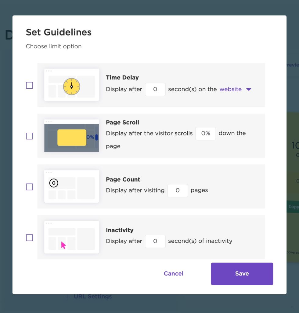
These are time-based display rules. The most common include:
Time delay: Show pop-ups only to users who have stayed on your page for a specific time period. For example, perhaps you trigger a time delay pop-up to appear on your product pages 60 seconds after the user lands on the page, to give them time to consume some of the product page content.
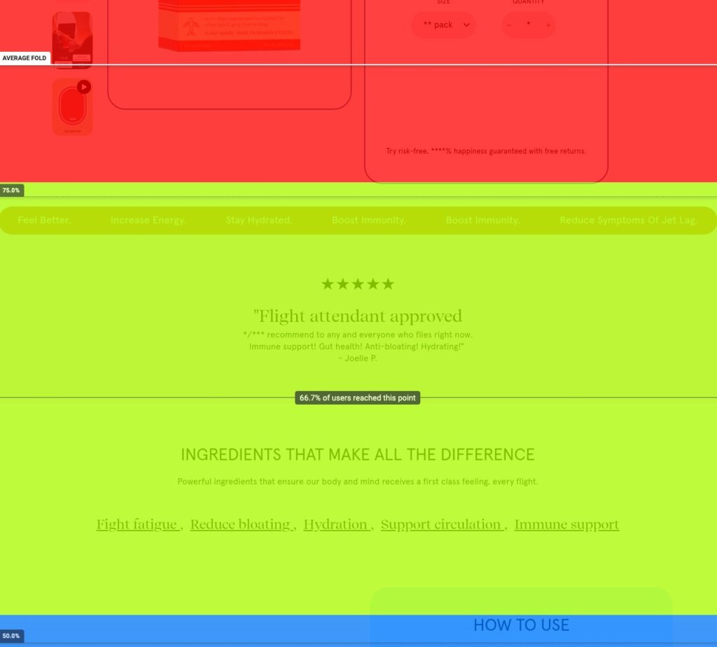
Page scroll: Display a pop-up when the user scrolls to a specific point down the page. This is useful to capture user attention just as it wanes. Using a heatmapping tool like Hotjar, look for the portion of the page that loses the most people, and put the pop-up right before that. Here’s an example of a heat map from one of my store’s product pages. I might trigger a pop-up to appear only after the user hits the middle of that green area since 65% of users make it to that point.
Page count: If you want to avoid displaying pop-ups immediately in your user’s sessions, consider a page count pop-up display rule. This will serve the pop-up only after the user has visited a set amount of pages on your site. For example, you may choose to display it only after the second page. This is especially effective for mobile organic search users, as it will help you avoid potential penalties from Google for intrusive interstitials.
Exit Intent: Exit-intent pop-ups appear (mostly on desktop) when the visitor indicates they are about to leave the page by moving their cursor up toward the back button. While this is often seen as an effective display rule, if the user is already on their way to leave, your conversion rate might suffer.
Inactivity: Setting pop-ups to appear after a certain period of inactivity can compliment exit-intent experiences. While some online shoppers do exit out of their sessions, many open a new tab and instead let their sessions go inactive. You may choose to trigger a pop-up to appear after 30 minutes of inactivity to draw the user back to the page.
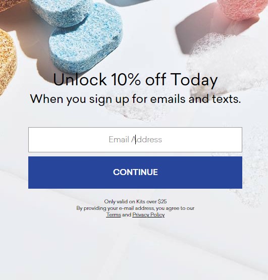
Action-Based: Pop-up display rules don’t have to follow a specific time or number of pages. Timing your pop-ups to appear after the user takes a specific action on your site can be an effective way to engage them. For example, Blueland waits until after you add an item to your cart to offer 10% off in exchange for your email address. By waiting to see if users are engaged, they are less likely to annoy users who are just browsing — and more likely to get an email address.
Dynamic Intent-Based Pop-Up Timing
If parsing out display rules based on channel, type of visitor, device, and user behavior seems complicated, it’s because it is.
And while it certainly will put your pop-up in a better position to succeed by segmenting this way, it can quickly become a lot to keep up with.
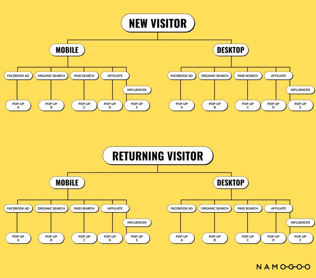
This complexity puts eCommerce stores in a bad position, with over-simplified and therefore less effective pop-ups. That’s a shame because this is the difference between a smart, experiences-enhancing, converting pop-up strategy, and an intrusive, annoying, potentially damaging one.
And even if you have a setup like the branching logic image above that runs like a well-oiled machine, you’re still limited to offering generic promotions to each user within the segment, leaving revenue, margin, and conversions on the table.
This is why the world’s top eCommerce stores opt for a simpler, more effective pop-up display strategy: dynamic pop-ups based on customer intent.
Displaying the right promotion and pop-up experience for each individual user optimizes the experience and incentive for the action each user is most likely to take.
So that means your pop-ups will only display to users who are likely to act on your call to action, when they are most likely to act on it. This removes the need for triggering your pop-up timing based on standard display rules.
Since the users on your site expressed an interest in purchasing your products, a pop-up offering an incentive feels helpful, not pushy.
#5. Create a Sense of Urgency
Pop-ups are attention-grabbing. When set up strategically, that’s what makes them such a powerful conversion driver.
But as we learned earlier in this article, online shoppers are inundated with interstitials and advertisements, so one of the keys to a high-converting pop-up strategy is giving your visitors a reason to take your call to action immediately by triggering a sense of urgency.
This can be done through:
Countdown timers. Leverage countdown timers if your sign-up incentive expires or you’re holding a limited-time promotion:
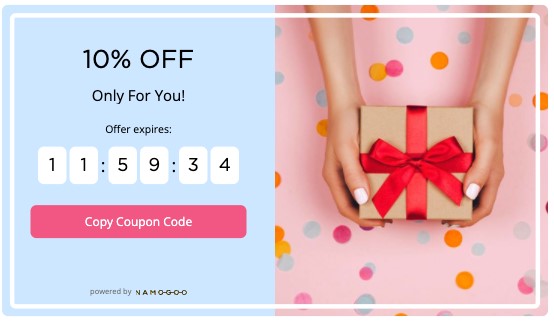
This urgency trigger can be powerful. When I’ve tested implementing a countdown timer on a pop-up for an eCommerce client, we saw a 31% increase in transactions and a 40% increase in average order value. Just be careful not to overdo it.
- Progress bars. Progress indicators, like a progress bar or highlighting already-completed steps are a smart CRO move. Not only do they trigger a sunk cost bias, but they can also be effective at triggering urgency.
- Inventory notifications. Inventory availability is a tangible and understandable reason to provide when triggering scarcity. When shoppers are browsing products with limited inventory, let them know that the items they’re interested in may not be available for long through your pop-ups. For example, check out how Kate Spade uses basic messaging to trigger scarcity in its pop-up:
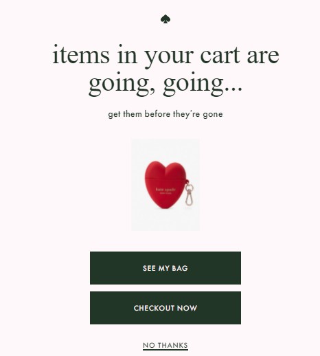
This displays for users who added items to their cart but haven’t checked out yet.
- Cart expiry time. If customer shopping carts expire after a set period of time for inventory management purposes, leverage that through your pop-up to trigger that urgency to check out.
If your visitors leave your site without taking action in the same session, they are unlikely to return. Once you’ve lost their attention, you’ve lost it forever.
So leverage your visitors’ forward momentum in the same session by creating a sense of urgency or scarcity in your pop-ups.
#6. Deliver a Different Experience on Mobile
Have you ever tried to fill out a non-optimized form on a mobile device? You have to pinch and drag, the screen skips around, and finding the right field can be all but impossible…
Who am I kidding? You’d have probably just left the site!
Like forms, pop-ups work differently on mobile devices than desktops. Smaller screens and smaller keyboards mean your pop-up needs to be easier to close and take up less space.
Mobile visitors shouldn’t see the same pop-ups as desktop users. For example, as we mentioned earlier, exit-intent doesn’t really work for mobile devices because mobile users simply tap “back” without any warning of leaving your site like moving their cursor toward the X. Instead, use other triggers to personalize mobile pop-ups, such as onsite behavior.
Consider changing the format of your pop-up on mobile as well. Flyouts and bars may work better than pop-ups, as they allow users to continue scrolling while sharing the same information.
Hobbii uses this strategy. Rather than using a popup about their sales, they use a bar on mobile devices:
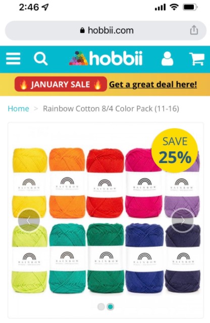
While on desktop, they use a pop-up to gather emails:
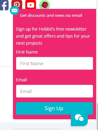
For example, on desktop, a pop-up about free shipping might be incredibly effective.
On mobile, however, a top bar with information about free shipping shares the same information without interrupting the user experience.
Pop-ups work, but exploring other options for your mobile users may protect the user experience.
#7. Enable Reminders to Allow Users to Recall Previously-Dismissed Pop-Ups
Once you’ve leveraged dynamic pop-ups or set up display rules to time your pop-ups appropriately, you’re set, right?
Not quite.
Even if you offer the perfect incentive for each individual, tailor the messaging to the customer segment, and display it at the perfect time in each session, most users will close your pop-ups.
Some do so before they even register what’s being offered, and others simply aren’t ready for a promotion yet. If you use an analytics tool like HotJar, you can see for yourself just how prevalent this is. Check out this recording of a user on my store’s site:
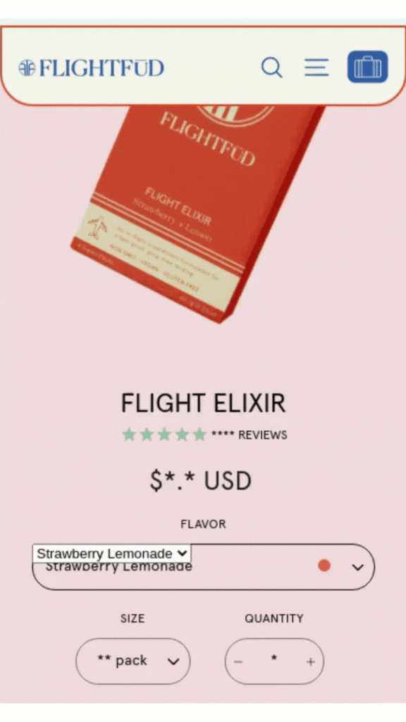
Notice how the user exited out of the pop-up almost instinctively? This is just one of many recordings just like this.
So to help overcome the knee-jerk reaction of exiting out of an interstitial, and allow visitors to recall the pop-up they previously dismissed, consider implementing promotion reminders.
A promotion reminder is a small icon usually placed at the bottom or on the side of the screen that appears when a pop-up is closed, so the user can still trigger it later.
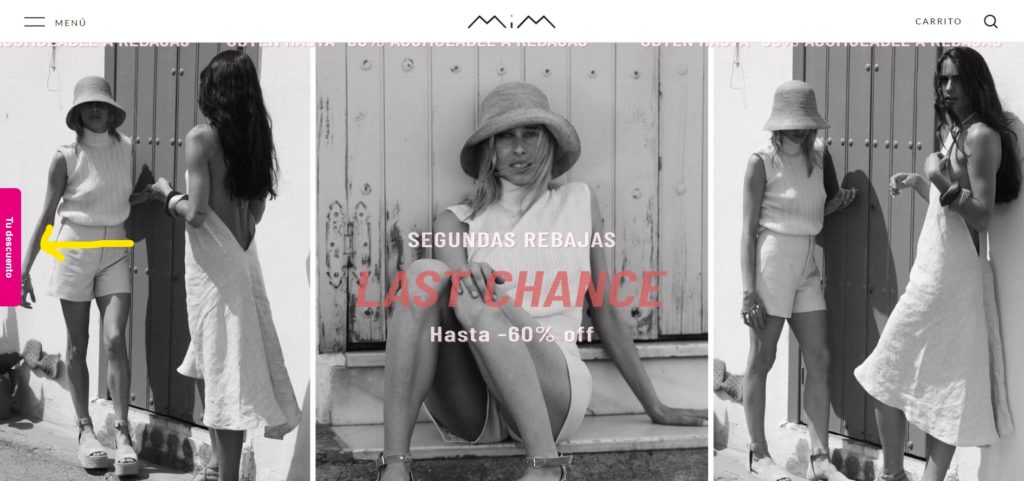
In Intent-Based Promotions, you can activate the Promotion Reminder in the Promotion Studio.
Click on the Reminder tab, and select Show Promotion Reminder.
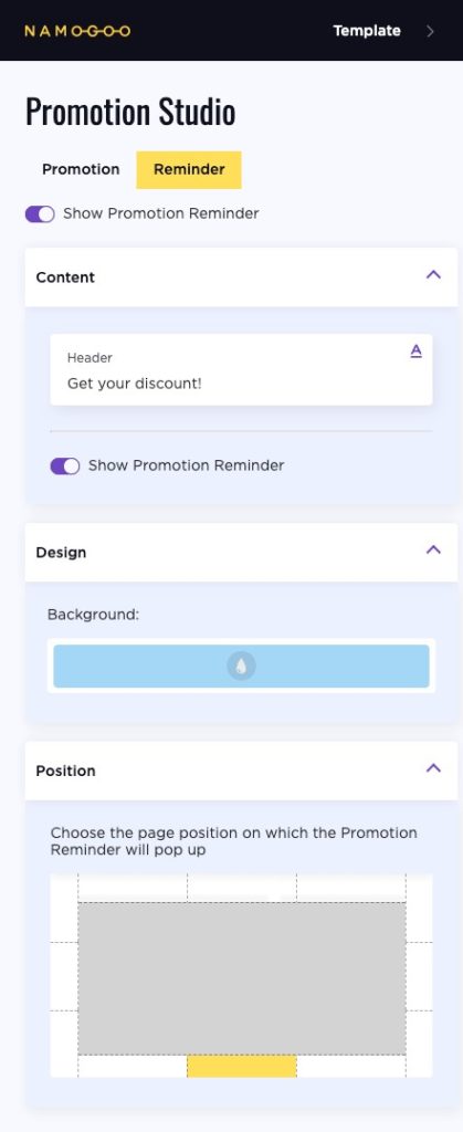
Tweak the copy and design to your liking, and press publish!
#8. A/B Test Your Pop-Ups to Improve Conversions
If you’re not using a machine-learning-based pop-up solution that optimizes your campaigns automatically for each individual shopper, you need to be A/B testing.
By testing different versions of the same pop-up, you’ll get a better understanding of what drives your users to take action.
For example, you might find that a specific CTA is more likely to encourage users to provide their email addresses.
You can also test:
- Headlines
- CTAs
- Messaging
- Offers (for example 10% off versus free shipping)
- Colors
- Images (with or without or the type of image)
- Timing rules
- Number of form fields
- SMS vs email collection
- Segmentation
Run A/B tests for at least two weeks to gather enough data, or longer if you’re targeting a page with less traffic. Then, take the winner and try a different version to see if you can continue to improve conversions.
Drive Conversions and Loyalty with These Pop-up Marketing Best-Practices
Shoppers have more options than ever when shopping online. When used well, pop-ups can help your brand stand apart from the competition — and drive conversions.
Keep user experience in mind when designing your pop-ups. Does your pop-up provide something of value for users or does it just benefit your brand? Make sure pop-ups are useful and target users that are most likely to act on them.
You can target pop-ups based on past behaviors, but for best performance, leverage machine learning to display the right promotion to each individual based on data collected from 5 billion sessions per month through Intent-Based Promotions.
To avoid SEO issues, follow Google’s best practices. This means pop-ups should not cover content, should only display on the second page for mobile, and don’t redirect users to another page.
Finally, if you’re pop-up app doesn’t use machine learning to dynamically serve pop-ups based on each individual’s signals, A/B testing is particularly important. Experiment with different CTAs, copy, and offers.
Like other marketing strategies, static pop-ups should be tested regularly to maximize conversions.


