Bonus Material: 17 Best-in-Class Pop-Up Strategies to Inspire Your Promotions
Despite the polarizing debate about website pop-ups, you know they can be effective tools for driving eCommerce conversions.
You’ve researched pop-up advertising best practices, you’ve primed your design team to understand what makes an engaging pop-up, and you’ve explored your pop-up app options.
You’re almost ready to kick off your onsite pop-up strategy.
The only thing left to do?
Arm your team with best-in-class website pop-up examples for inspiration.
That’s where we come in.
In this article, we’ll take a look at high-converting pop-ups from 17 top eCommerce stores.
You’ll learn why each pop-up example works and the strategies these stores use to drive email and SMS subscribers, conversions, and revenue.
Promotional Pop-Up Examples
Whether it’s a welcome coupon for 10% off first orders, or an AOV-boosting free shipping promotion, most eCommerce stores offer an incentive in their pop-ups.
After all, web users are exposed to thousands of ads and receive an average of over 100 emails every single day[*][*]. Asking for an email address or phone number without offering something in return won’t garnish you many emails.
If you’re looking for promotional pop-up ideas, draw inspiration from these examples from top eCommerce brands.
#1. Trigger the Sunk Cost Bias with a Multi-Step Pop-Up
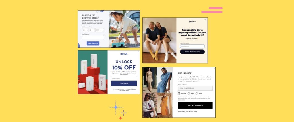
The natural self-care brand Native knows how to set up a promotional pop-up.
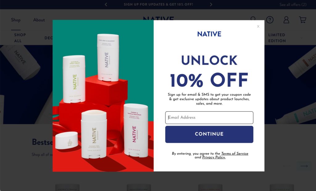
This example not only provides a 10% welcome discount, one of the most common types of promotions, but it also does so through a 2-step opt-in process.
The first screen collects the user’s email address and promises exclusive updates about product launches and sales:
And when the user presses the Continue button, they’re taken to another screen where they enter their phone number to sign up for texts to finish the form and get the discount.
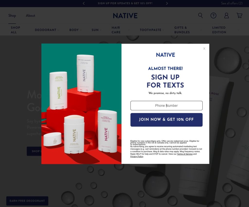
While we have no way of knowing what the conversion rate on this pop-up is, I would bet that it converts better than a one-step pop-up where both email and phone number form fields were on the first screen.
Progressing the user to the second screen to enter their phone number likely provides some conversion uplift via the “sunk cost bias”, which is “the phenomenon whereby a person is reluctant to abandon a strategy or course of action because they have invested heavily in it” (Oxford Languages).
Visitors may be less likely to click that little grey X when they’re asked for their phone numbers since they’ve already taken it halfway there.
What’s really unique about this pop-up idea is how it is triggered. Rather than being served the form, the user triggers it themselves by clicking on the “See all offers” link:
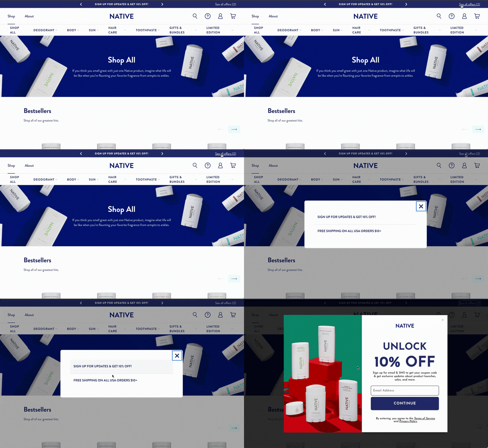
Native’s pop-up is unobtrusive, taps into an important psychological trigger, and gathers both email and phone numbers in exchange for a discount.
Strategies to steal: Experiment with collecting more information from visitors in exchange for a discount by playing into that sunk cost bias. Try letting the user trigger the pop-up rather than serving it to them.
#2. Hack Your Customer’s Psychology with Personalized Incentives
Personalizing the onsite customer experience to each customer is a winning strategy in 2022.
And it’s easy to do that based on first-party data. There are plenty of apps that allow you to identify the products each customer has expressed interest in so you can personalize your recommendations during their session.
But you don’t have to stop there. You can provide a personalized pop-up experience as well.
At first glance, it might not seem like there is anything special about this next example from the clothing brand Son de Flor:
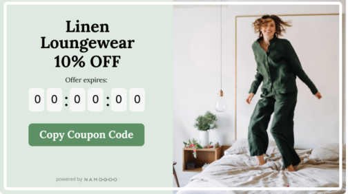
But it’s far from just an ordinary, albeit well-designed and time-limited offer.
This promotional pop-up leans into the power of AI and machine learning via Intent-Based Promotions to personalize the incentives offered to each shopper, serving each individual customer the exact, minimum offer they’re most likely to need to convert.
It works by calculating shoppers’ purchasing patterns and intent to determine the right offer for each specific customer during their session.
Intent-Based Promotions’ decision engine takes into account not just the user’s first-party behavioral and intent data, but also billions of weekly sessions across the top eCommerce sites in the world.
And to make it perform even better, Intent-Based Promotions serves the pop-up at exactly the right timing to enhance, rather than detract from the customer’s shopping experience.
The crazy results? In less than two weeks, the brand has been able to increase orders from first-time visitors by 26% through Intent-Based Promotions, and increase revenue by 233%.
Discover the two simple promotions Son De Flor used to improve conversion rates and revenue here.
Strategies to steal: Experiment with collecting more information from visitors in exchange for a discount by playing into that sunk cost bias. Try letting the user trigger the pop-up rather than serving it to them.
#3. Create a Sense of Urgency with a Limited-Time Incentive
If you don’t give visitors a reason to convert now, they likely won’t convert ever.
Think about it. The average conversion rate for eCommerce stores was 2.9% in 2021. And the average cart abandonment rate was 69%.
Most online shoppers are casually browsing, and even if they intend to return to your site to make a purchase after they leave, most never will.
So the key to dealing with this unfortunate fact of eCommerce life is to increase your same-session conversions.
And how do you do that, you ask?
By leveraging a countdown timer on your pop-ups to create a sense of urgency and give visitors a reason to convert immediately.
This popular slipper brand isn’t just offering a standard 10% off for an email address. Instead, they deliver a customized incentive based on the discount amount most likely to drive each user to convert with Intent-Based Promotions.
Then, they create that urgency trigger with a countdown timer to communicate that the offer is only available for a limited time.
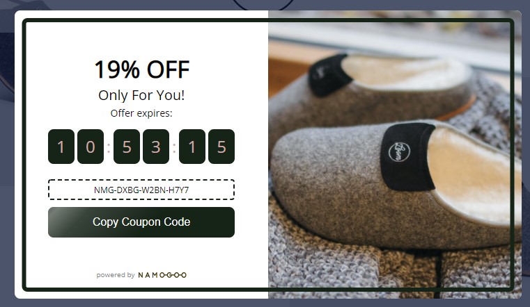
Urgency and scarcity are some of the oldest conversion tools in the book, and that’s because they work.
While you could include the time limit in your pop-up copy, a countdown timer provides a visual representation of this consumer psychology trigger. The discount code offered is only active for a few hours — giving users long enough to look around the site and choose the right slippers.
When I’ve previously tested implementing a countdown timer to trigger urgency, the variation with the timer resulted in a 31% lift in transactions, making this an example worth paying attention to.
Strategies to steal: Experiment with collecting more information from visitors in exchange for a discount by playing into that sunk cost bias. Try letting the user trigger the pop-up rather than serving it to them.
#4. Allow Users to Recall Previously Closed Pop-Ups
Have you ever been served a pop-up, exited out of it almost instinctively, and then regretted it later when you realize that you didn’t capture the promotion you were offered?
I did this exact thing just yesterday, and you can probably recall a time you’ve done it, too.
Even if you use the pop-up ideas in this guide to create the perfect pop-up with compelling imagery, personalized incentives, and messaging that connects with each customer segment’s psychographics, most users will close your pop-up.
For example, check out this recording of a user on my store’s site:
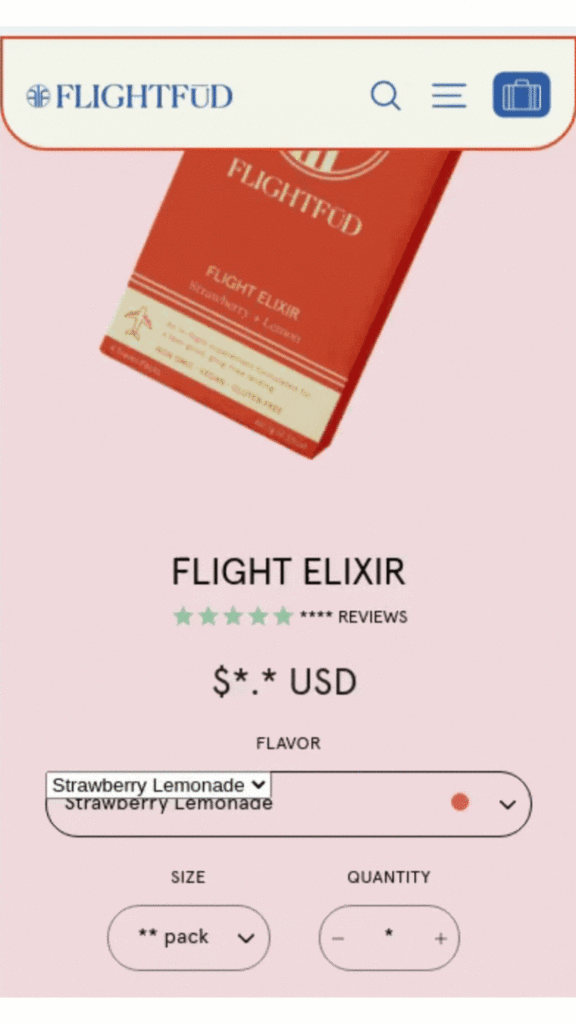
Notice how the user exited out of it almost instinctively? This is just one of many recordings just like this, because it’s a prevalent issue for eCommerce stores.
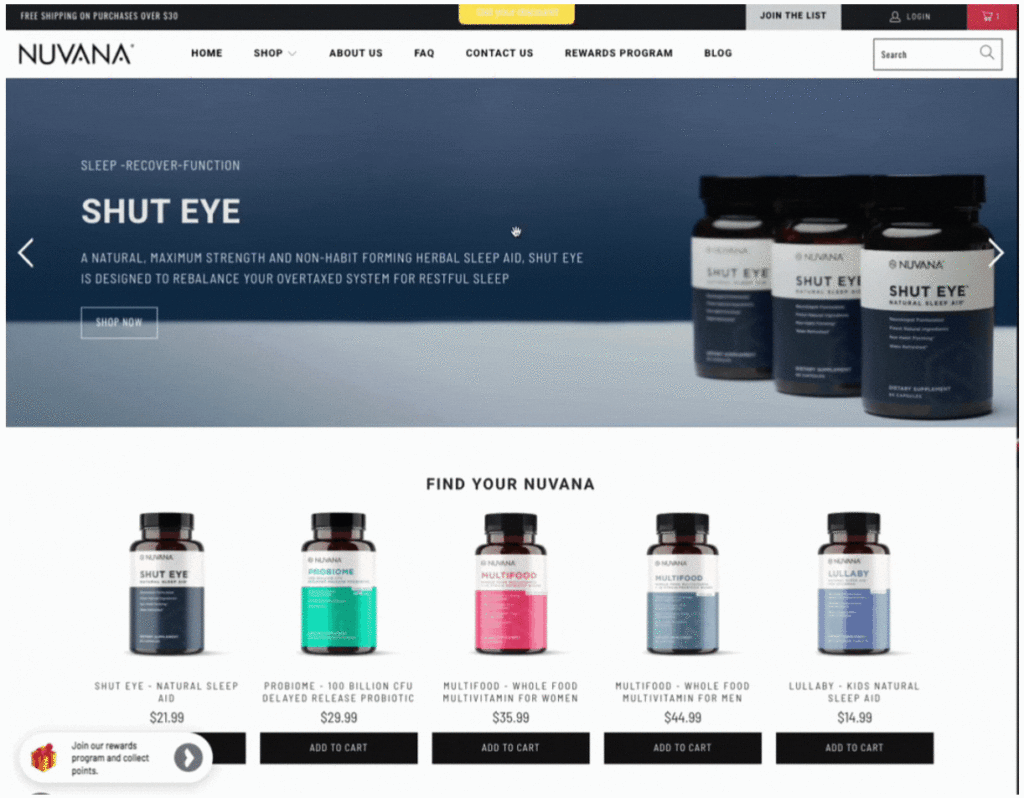
This pop-up example from a popular supplement brand not only ties many pop-up best practices into the design and incentive:
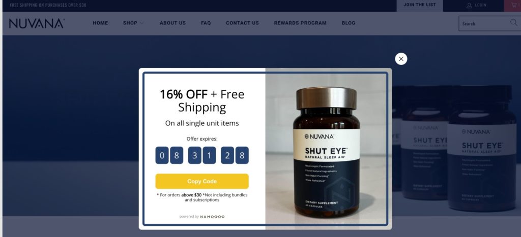
But also provides a solution for the users who close your pop-up before taking action.
This example works so well because it utilizes a promotion reminder to allow visitors to recall the pop-up they previously dismissed.
A promotion reminder is a small icon or tab found around the perimeter of the screen that appears when a pop-up is closed, so the user can still trigger it later. See how my example works below:
If you use Intent-Based Promotions, this is an available feature that you can implement right away. Just activate your Promotion Reminder in the Promotion Studio by clicking on the Reminder tab, and select Show Promotion Reminder.
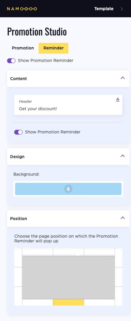
If you don’t use Intent-Based Promotions, check to see if your pop-up app has made this available yet (It may be called a teaser or a nudge).
Strategies to steal: Implement a promotion reminder on your site to allow your visitors to bring up pop-ups they’ve previously dismissed.
#5. Be Mysterious to Tap Into Your Visitors’ Curiosity
Props to the genius marketing minds behind this next example of an eCommerce pop-up.
Jambys is a loungewear brand that offers sustainable “inactivewear”. New visitors to the website are shown this pop-up designed to gather email addresses:
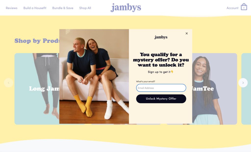
At first glance, this pop-up might seem like a typical, albeit well-designed and expertly copywritten form. It has a form field for the user’s email address, a button, an image, a headline…
It even utilizes consumer psychology with the word “Unlock.”
But that’s not why this example is so awesome. It made it in this article because it’s perfectly intriguing and leaves the visitor wanting to learn more by not even mentioning the amount of the discount they’re asking users to sign up to get.
While some brands use a direct discount amount (like 10 or 15% off), Jambys uses intrigue. By not explaining what discount they’ll receive, users are curious — they want to sign up and find out. It makes users feel like they’re joining a club that not everyone is a part of.
It also gamifies the experience, sort of like a “spin to win” email capture game, but less prone to visitors considering it “spammy”.
When the user signs up, they’re given a 15% off welcome discount.
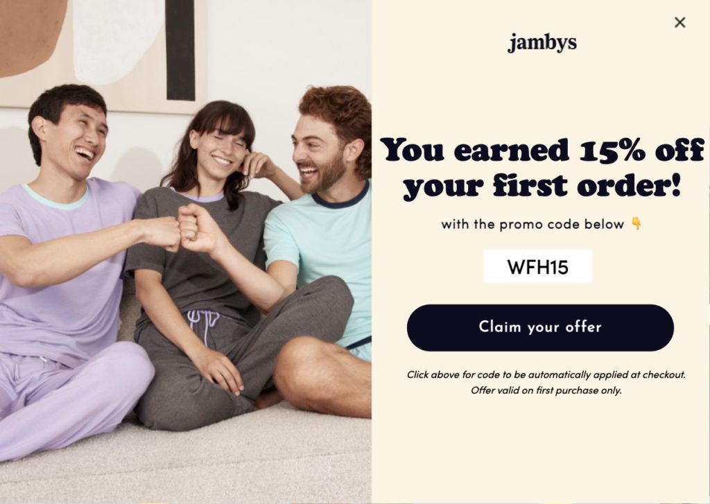
Strategies to steal: Leave a little to the visitor’s imagination and gamify your pop-ups by revealing your offer only after users subscribe.
#6. Boost Average Order Value AND Margins with an Intent-Based Pop-Up
This genius pop-up from one of our customers, a high-growth skincare and clean beauty brand is a triple threat.
Not only does it incentivize conversions, but it personalizes the customer experience and increases the brand’s average order value at the same time.
The brand does this through an Intent-Based Promotions campaign that personalizes the discount offered to each individual shopper based on real-time intent.
It then stacks the personalized incentive with a minimum order threshold for the discount to apply.
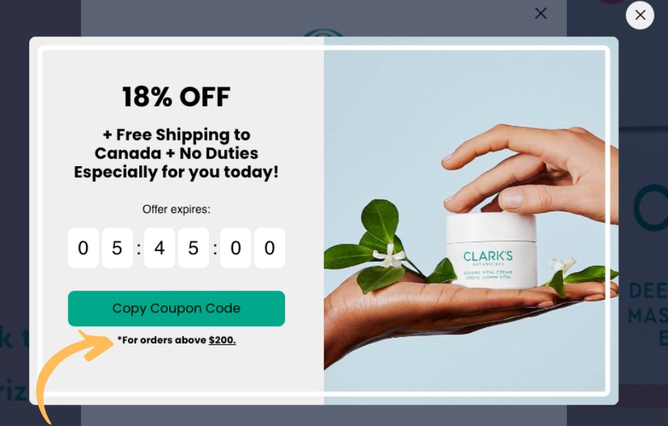
The pop-up campaign subtly encourages shoppers to increase their cart value by rewarding them with a discount on orders over the minimum threshold.
Beyond increasing AOV, these types of promotions also help you:
- Clear out more inventory at once, and
- Reduce the customer’s mental hurdle of spending more because they’re also saving money through the discount.
This helps to improve your margins as well because shipping and fulfillment costs take up a smaller portion of the order value.
And when you pair this strategy with personalizing the discount dynamically, you take away the guesswork around the best discount tiers to offer to convert each person.
Strategies to steal: Boost your average order value and tailor the experience to each individual by setting a minimum order threshold to redeem an incentive. Our example brand uses $200 as its threshold, but you can set your own threshold based on your margins and existing average order value.
Lead Generation Pop-Up Examples
Most online retailers focus their pop-up experiences on promotions, opting to attempt to land a sale rather than generate leads.
But even the best-converting eCommerce stores lose at least 95% of their visitors, and very few will return to make a purchase later without being remarketed to.
Which is why these pop-up form examples made the cut: they focus on capturing visitor contact information to draw the user back to the site later.
#7. Engage Visitors at the Top of the Funnel with a Lead Magnet
Offering a discount or promotion to high-intent visitors can incentivize those users at the middle and bottom of the funnel to move toward a conversion.
But what about your visitors at the top of the funnel? The ones who aren’t ready for a promotion yet? How do you incentivize those users to sign up for your email list so you can nurture them down the funnel?
Take some inspiration from this next pop-up example.
The subscription box brand Black Girl MATHgic engages site visitors by offering a free guide to build math confidence.
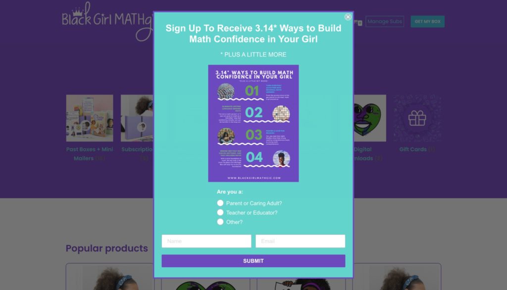
There are a few factors at work here — first, the brand offers something of value. They also include radio buttons so new subscribers can identify whether they’re a caretaker or an educator and self-segment.
Finally, they make it easy to close the pop-up and never see it again. Even users annoyed by pop-ups will be happy to see they can turn it off and get back to your site without additional interruptions.
Strategies to steal: Take a page from SaaS companies and offer a lead magnet to capture the contact information of site visitors that aren’t yet ready to buy. Consider doing so in.
#8. Run a Daily Giveaway to Gather Email Addresses & Boost Deliverability
This pop-up from Magic Spoon is an excellent way to generate leads without having to offer a discount.
The grown-up cereal brand offers visitors a chance to win free cereal in a daily giveaway, which not only successfully grows its email list, but also supports deliverability as well.
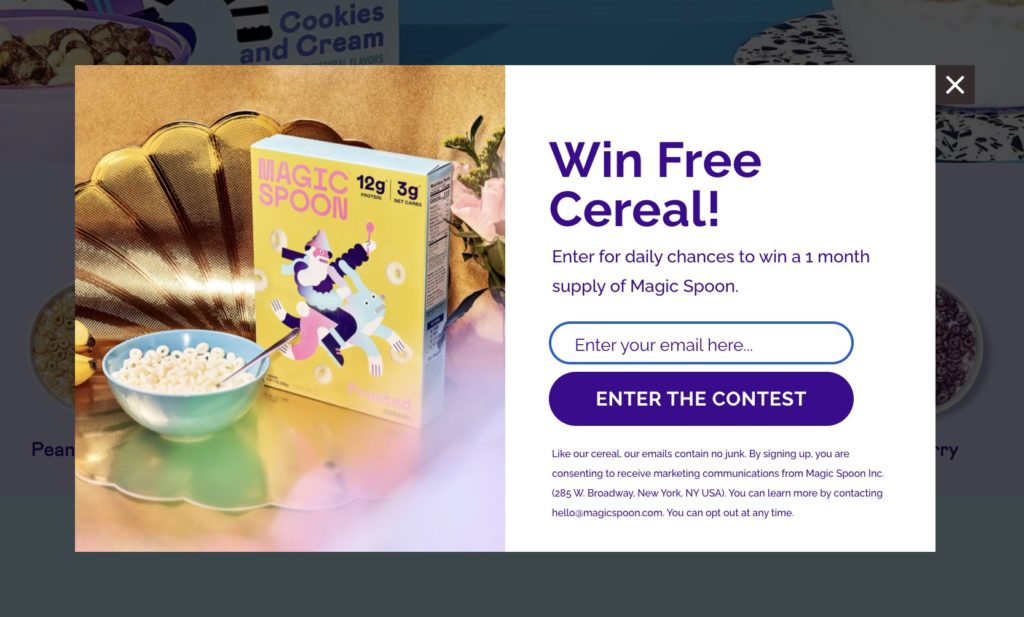
How? The keyword here is daily.
By drawing and announcing winners through email daily, Magic Spoon encourages their subscribers to open and engage with emails regularly. This is smart, because the more your subscribers engage with your emails, the better your sender score, which is crucial to ensure your emails land in the inbox rather than the spam folder.
Strategies to steal: If you want to avoid offering a discount or your products don’t lend themselves to a lead magnet, try a giveaway! You don’t have to draw winners daily to encourage engagement; even weekly would be sufficient.
#9. Double Up By Gathering Phone Number and Email Without Being Obtrusive
Email marketing is effective, but SMS messaging tends to be more reliable and is delivered directly into the user’s hands.
No “promotions” folder, no worrying about deliverability, no clamoring for attention in a sea of hundreds of emails.
So why not double up by gathering both email and phone numbers at the same time like this pop-up example from the following luxury goods eCommerce marketplace:
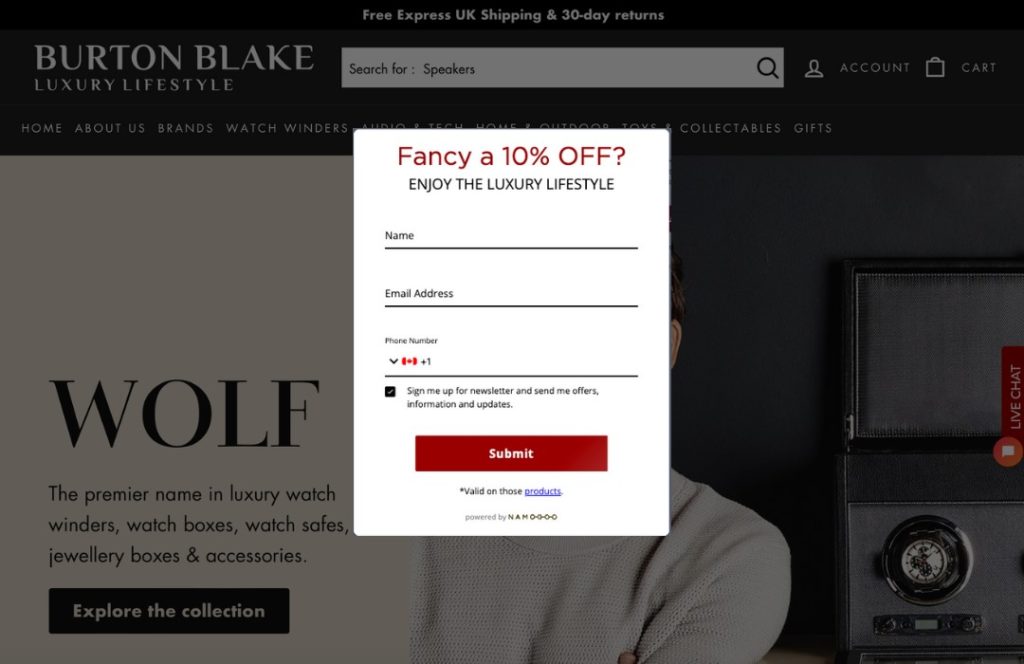
The pop-up features a minimalistic design with clear messaging that speaks directly to the brand’s target audience. Visitors aren’t just joining an email list — they’re joining a lifestyle.
The brand also offers a 10% discount, which gives subscribers an immediate benefit to signing up.
Strategies to steal: Ask for email and phone simultaneously. SMS messages are convenient and have better deliverability rates than email. Just make sure to make it worth it to users with a valuable offering.
How do you know what offer each user will respond to? Intent-Based Promotions’ Grow Subscriber List (GSL) campaigns allow you to run email/phone capture promotions as intent-based campaigns. The AI-powered Prediction Engine uses machine learning based on billions of online shopping sessions each week plus each user’s onsite intent signals to determine the minimum discount required to convert each user, driving leads and lowering the cost per lead. It’s a win/win!
#10. Manage Competing Priorities with a Click-Triggered Pop-Up
Email/SMS subscriber list growth is a common eCommerce KPI.
But lead generation is a micro-conversion, and it shouldn’t compete with your macro-conversion event, which is almost always landing the sale.
That’s why this pop-up idea from the aperitif brand Haus is so smart.
Rather than serving a phone number or email capture form instead of a promotional pop-up and forgoing those direct conversions, or having to choose, Haus includes a link in their primary menu tilted Newsletter. When the user clicks on it, an email pop-up appears:
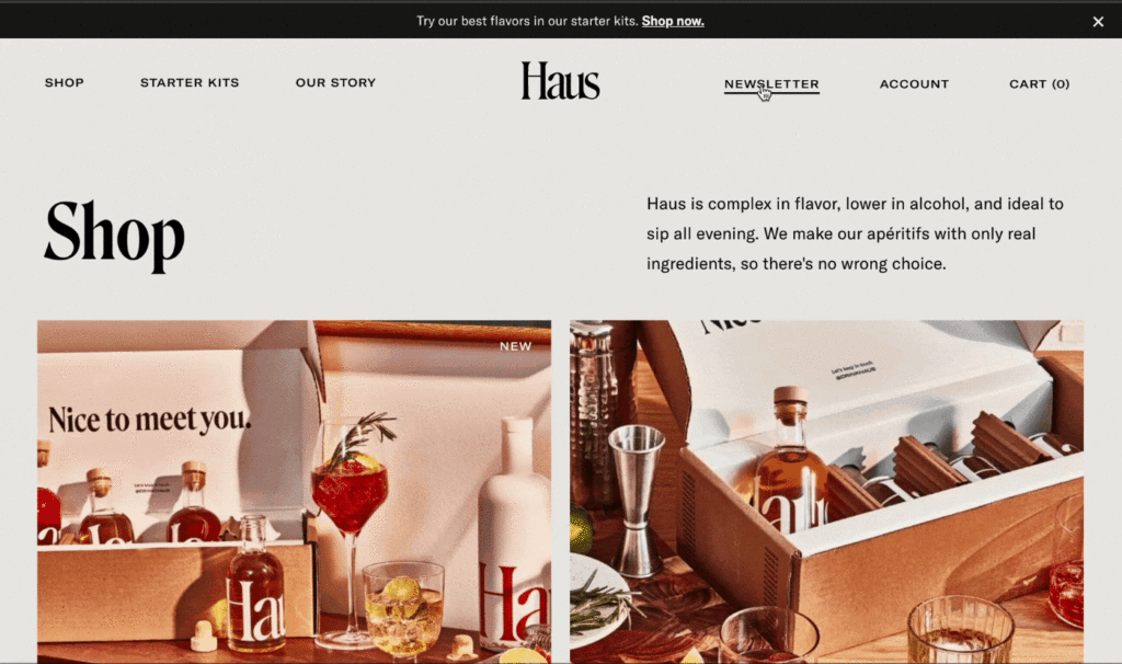
This is an excellent use for a triggered pop-up. Embedding the sign up form on a landing page would have done the trick, but not without interrupting the customer journey.
Plus, now the brand is free to serve intent-based promotions in their pop-ups and drive more direct conversions.
Strategies to steal: Drive email or SMS list growth without having to worry about email signup calls to action competing with conversion-focused CTAs with a click-triggered pop-up. Then, serve personalized promotional pop-ups (ideally triggered based on AI-powered machine learning) to enhance the shopping experience and encourage users to convert at the right time.
Segmentation Pop-Up Examples
As we move toward a cookieless world, gathering PII data should be at the top of eCommerce team’s priority lists right now.
The more data you gather about your customers, the better you can remarket to and retarget visitors that didn’t convert during their first session, and personalize the customer experience.
These examples can provide you with inspiration and pop-up ideas to gather more information from your visitors to get a head start on segmenting them in your future communications and campaigns.
#11. Solve Your Audience’s Pain Points & Enhance Your Remarketing Capabilities
Say I was going to a young child’s birthday party this weekend, and I asked for your help in choosing a toy to give to her as a birthday gift.
What would you recommend?
Blocks? Stacking cups? A puzzle?
I’m sure you know that’s a trick question. You wouldn’t be able to answer it without knowing the child’s age (at a minimum)!
That’s why this example from the toy subscription company Lovevery is so awesome.
Lovevery’s pop-up promises to solve the pain point that anyone who has ever cared for a child has experienced: keeping them busy and engaged.
(If only I had a dollar for every time I Googled or asked about age-appropriate activities for my kids.)
But Lovevery’s pop-up doesn’t stop there. It also collects the date of birth of the child the visitor is shopping for:
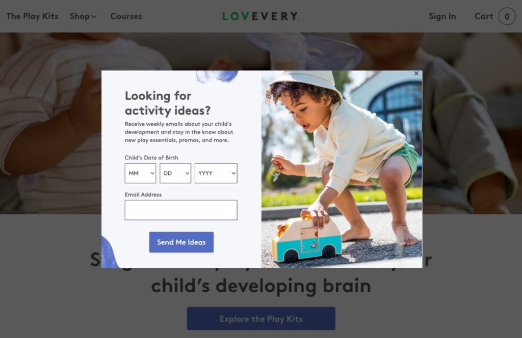
So now, rather than having a bunch of trick questions on their email list, Lovevery can segment subscribers based on the child’s date of birth and refine their messaging, offerings, and product recommendations.
In this well-thought-out pop-up, Lovevery is even more strategic than initially meets the eye.
Rather than simply asking for the age of the child, the brand collects the exact birth date.
This opens up opportunities to surprise and delight customers by sending a birthday wish or offer as the birthday draws nearer. They could also send reminders to family members to order a birthday gift, and learn more about their customers for more effective retargeting.
Strategies to steal: What crucial piece of information do you need from your subscribers to ensure you’re not taking a shot in the dark when you send them emails? Find a way to collect that information by helping them solve a problem or pain point that the information is required to help solve as Lovevery does.
#12. Gather Customer Information With a Giveaway & Pop-Up
We saw a multi-step pop-up in our first example when we explored how Native triggers the sunk cost bias with their promotion.
In this example, the camera backpack brand Brevite does the same thing, except it draws users in with a giveaway, posed as a question:
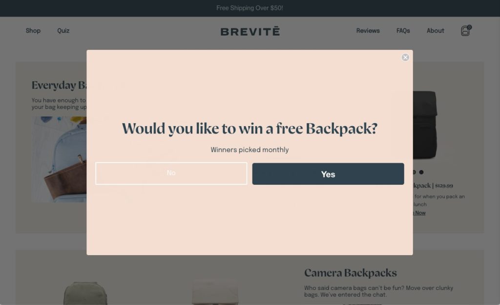
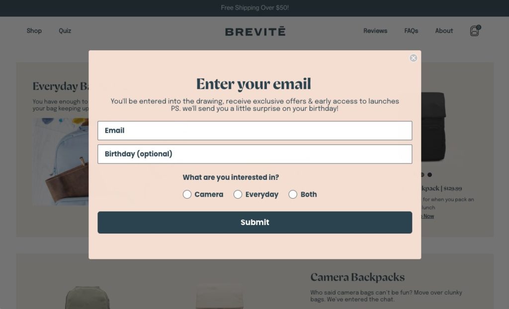
Then follows up with a multi-step opt-in pop-up. Only after you have already clicked “yes”, does the brand begin to collect more information, asking for the email address, birthday, and the type of bag the user is interested in:
But wait, there’s more!
After you press “submit”, you have a chance to sign up for texts to double your chances to win.
This keeps the form short and to the point, and most users will sign up for SMS as well. After all, they’ve already taken it most of the way. They might as well increase their chances of winning!
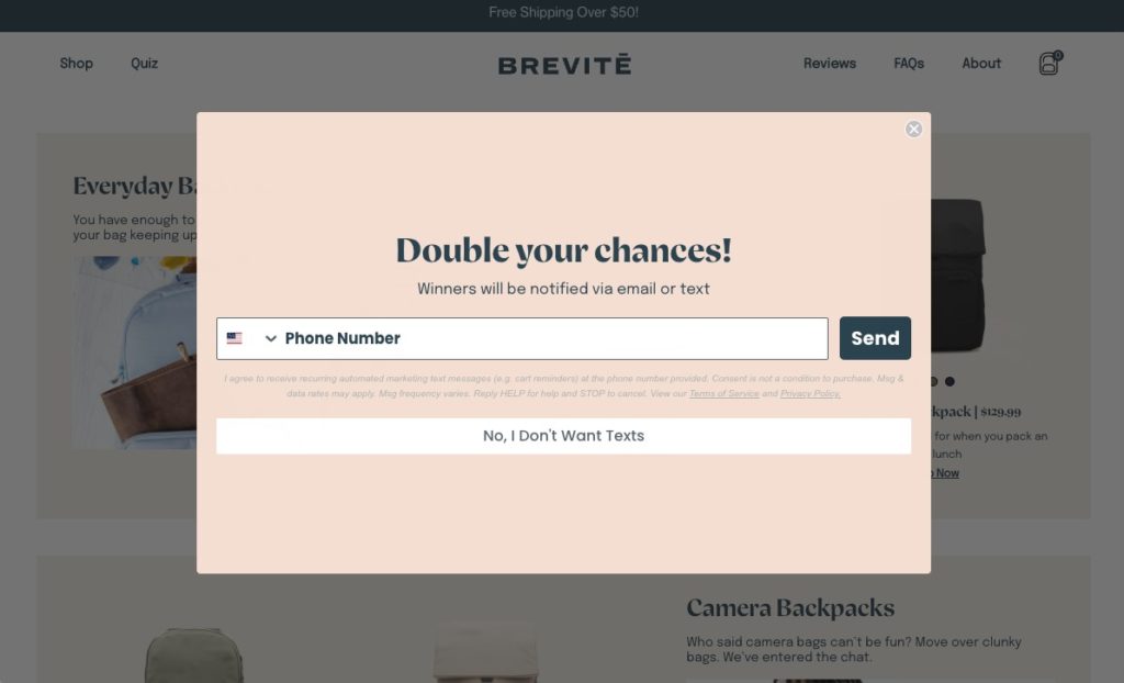
The fact that the pop-up mentions that the winner of the contest will be notified via email or text reduces the likelihood of contacts signing up with a fake phone number or email, making this pop-up a no-brainer to include.
#13. Collect More First-Party Data By Offering an Irresistible Prize
DarnTough Socks offers well-made socks with a lifetime warranty. That helps them stand out from other sock brands that offer variety, but often wear out after a few months.
While most brands only ask for an email address, DarnTough Socks goes all in by asking for the user’s full name, email address, and mobile number. This is a lot of information to ask for — but they make it worth your time by offering a chance to win seven pairs of free socks.
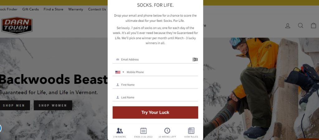
Longer forms have a reputation for reducing conversion rates. But DarnTough Socks uses a contest to encourage users to share their data and offer a valuable prize. Their socks range from $25 to $30 per pair, meaning the contest prize is worth as much as $210.
Strategies to steal: Gathering SMS data can help eCommerce brands reach their audience more directly, especially in a post-iOS-15 world. Offer a high-value incentive and consider leveraging gamification in the form of a contest to encourage users to provide their phone numbers, which are more sacred to consumers than an email address.
#14. Capture User Demographics for Improved Relevance
Revolve is a well-known designer clothing retailer that offers products for both men and women.
This brand’s website pop-up promises a 10% off welcome coupon, paired with a little flattery. But that’s not what makes this example great.
Revolve’s simple and nicely-designed pop-up not only collects the user’s email to access a discount code, but it also includes a field for gender, allowing the brand to personalize emails and ensure subscribers receive messages that are relevant to them — not just more inbox clutter.
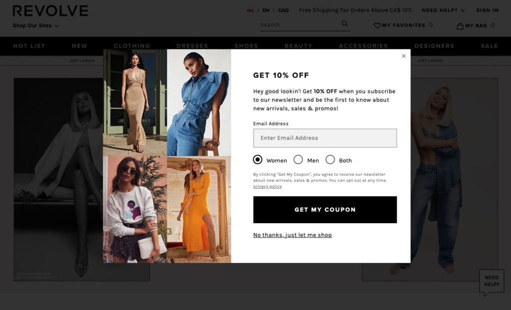
The radio button pre-selects Women by default, which I assume is because women make up more than half their audience demographics, lessening the friction for the majority of their visitors.
Segmenting your audience is crucial to increasing open rates and driving conversions from your email marketing. Online shoppers prefer personalized marketing over generic targeting strategies, and it’s easy to see why.
Strategies to steal: Collect some information from users as they subscribe to your email list! You’re already serving your pop-up to your customers anyway, you might as well sneak in a question or two to segment your new subscribers.
Engagement Pop-Up Examples
Pop-ups aren’t just valuable for promoting an incentive or lead generation.
These examples show how they can also be used to engage visitors by establishing trust through social proof, encouraging them to take a valuable action, or triggering exclusivity.
#15. Encourage Window Shopping
Sometimes, brands are able to pinpoint a valuable action that users can take as part of their funnel that paves the path to purchase.
And when that happens, it makes perfect sense to double down on that action, or micro-conversion, to incentivize it.
For example, some brands find that encouraging and incentivizing customers to leave a product review increases repeat purchases from existing customers and conversion rates from new customers.
With my company, FLIGHTFŪD, we’ve found that visitors are 11x more likely to convert after they visit a specific, educational page on our website vs. if they don’t visit that page at all.
It’s safe to assume that Wish, the gamified eCommerce marketplace has uncovered a similar action with daily logins.
This pop-up by Wish rewards users simply for logging in to the app by issuing digital “stamps” in exchange for 50% off once the user reaches 7 stamps.
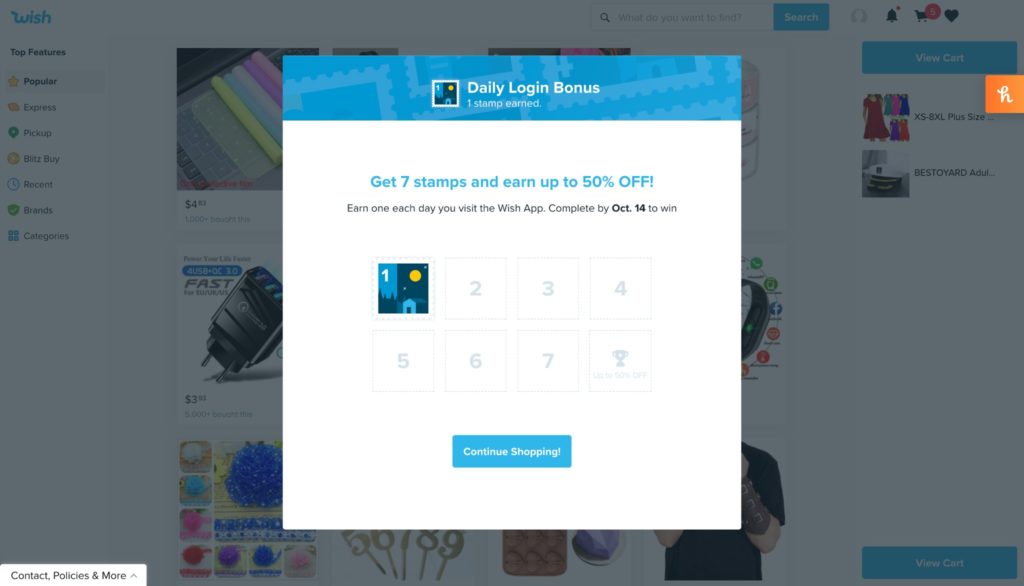
Wish likely wouldn’t be incentivizing daily logins if that wasn’t a valuable action along the purchase path for the brand.
The 50% off incentive is a generous promotion, which matches the call to action. Requiring users to log in every single day to get the offer sounds like a big ask, but the effort is counterbalanced with the reward.
Plus, the act of logging in to the Wish App every day for an entire week makes the brand top of mind, and can even sneak into users’ everyday habits or part of their daily routines.
And every time the user logs in? They’re presented with new products that match their interests, that they can then save for later or whenever they unlock their 50% discount.
Smart move, Wish!
Strategies to steal: Identify the actions users can take on your site that pave the conversion path, and incentivize those actions in your pop-ups.
#16. Make Social Proof Eye Catching
Ultramax offers respirator masks designed to be more environmentally friendly and clean air better. While most companies use pop-ups to gather email addresses, Ultramax went a different route.
As you browse the site, pop-ups display social proof in the form of customer reviews, including photos and star ratings.
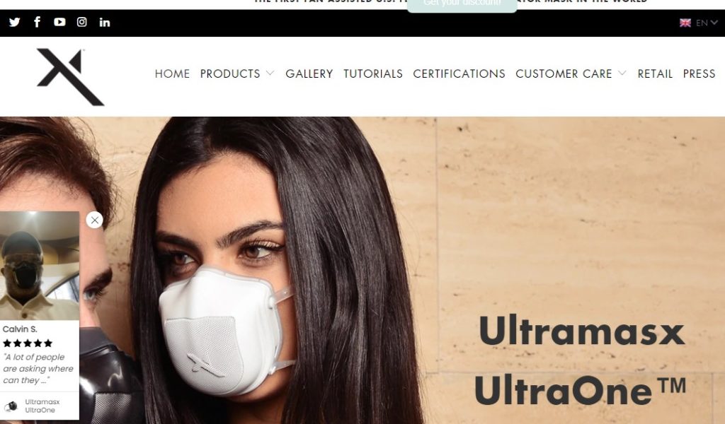
In this case, the movement of the form makes them eye-catching, and the images and names on reviews increase trust. Trust is especially important for the brand, as their masks cost nearly $100 — which is much more expensive than a disposable mask.
The social proof ensures buyers they are worth the cost.
Strategies to steal: Consider using pop-ups to drive conversions in other ways. For example, share social proof, suggest related products, drive traffic to other channels, or remind users of an item in their bag.
#17. Gate Your Entire Site to Create a Sense of Exclusivity
This next eCommerce pop-up example from the daily deals brand Zulily is a bold move, and it is certainly not right for every brand.
But it’s also undoubtedly effective for Zulily, and it’s such an interesting use of pop-up marketing that we had to include it in this article!
Zulily’s pop-up appears just seconds after a visitor lands on the site, and it prevents users from going any further without signing up or logging in. Visitors are required to become a member via an email subscription before being allowed to browse the deals on the site.
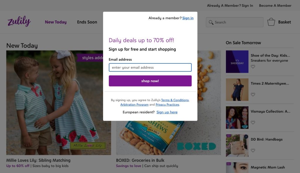
Essentially, if the eCommerce world were a city, Zulily would be an exclusive, members-only club, and this pop-up would be the bouncer. And your email address would be the cover charge, of course!
Gating the entire shopping experience with a signup form can be risky, but in some cases, high risk means high reward. The user benefits from having access to the daily deals Zulily is known for, and the brand benefits from improved engagement, better customer segmentation, and the ability to identify and communicate with their visitors long after they’ve left the store.
Pop-Up Success Starts With Staying On Brand
Are your pop-ups not converting the way you want them to? The strategies above can help you design valuable pop-ups your users will want to take action on.
Use copy they can relate to, and test different CTAs to determine what resonates with visitors. Consider offering a deeper discount to users who are further from conversion through intent-based pop-ups or use a contest to entice them to share more information.
Finally, don’t forget to test. It’s the most effective way to find out what pop-up ideas your audience will respond to.


