What is the Undercover Shopper Project?
The undercover project is where Namogoo’s eCommerce experts purchase from some of the best-known online stores to explore their onsite digital experiences and analyze how they achieved major success.
In this series of articles we’ll explore:
- The brands’ best tactics and strategies that fuel their growth
- Areas of opportunity for optimization
- Recommendations for A/B testing and experiments.
The Brand: Nuby
We’re kicking off this series with the young children’s brand Nuby.
If you’re a parent and live in the US, Canada, UK, and other parts of the world, you probably know this brand. As a parent of two little kids, my kitchen and diaper bag are filled with Nuby products, from baby spoons and sippy cups to pacifiers and toys.
Nuby is an excellent children’s product brand with a vast catalog, quality products, and a substantial retail presence.
Today we’ll explore Nuby’s strategies, tactics, and customer journeys from the perspective of an online shopper.
Part 1: Customer Onsite Experience
In this section, we examine the user experience from the second the potential customer lands on the brand’s website until they complete a purchase.
Onsite Marketing & Promotions
eCommerce teams should prioritize establishing a solid onsite marketing and sales promotion strategy. You spend time, effort and marketing budget driving visitors to your site, and a solid onsite strategy will help you engage with each of those hard-won visitors in the most effective way for them.
Nuby’s Pop-Ups
Pop-ups are a great way to engage with visitors, gather their contact information, learn more about them, and of course, drive them to convert.
Most eCommerce stores will serve a promotional pop-up to at least one customer segment during a browsing session because pop-ups can convert between 10-30% better than other lead generation modalities [*]. In fact, the top 10% of pop-ups have an average conversion rate of over 9%[*]
Note: It’s crucial to be strategic about how you implement pop-ups to avoid damaging the onsite shopping experience. (Read more about it here).
Welcome Coupon
Delivering a welcome coupon through a pop-up can be an effective way to engage with visitors.
When I landed on Nuby’s site I was served this pop-up.
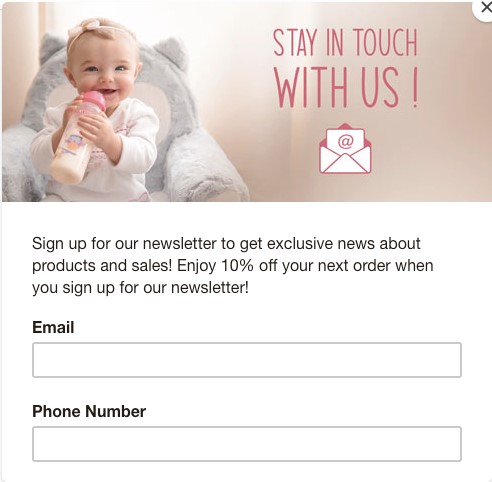
This pop-up is being offered to every type of visitor, regardless of their purchase intent, onsite behavior, or the specific customer segment they land in.
Recommendations:
- While Nuby does offer a 10% welcome discount, it’s not the main focus of its pop-up. We recommend displaying the discount incentive more prominently in the copy. The offer is what motivates visitors to give up their contact info.
- Tailor the welcome incentive to each individual based on their purchase intentions. While the standard 10% off discount is better than no offer, it doesn’t appeal to everyone.
-
- Some customers are more likely to convert when incentivized with a discount or offer others have high intent to purchase and don’t need an incentive to complete their order.
- Even just within the discount group, 10% will be excessive for some, and others too little.
-
- Many visitors are simply not ready yet to purchase and providing an offer might do more harm than good.
- If you aren’t using intent-based pop-ups, segmented promotions are the next best thing. They may not perform as well as intent-based experiences but personalization will definitely have a positive effect on the customer experience and Nuby’s revenue. For example:
- Offering a welcome coupon only for new customers will help to protect customer perceived value.
- Ensuring returning customers see a different offer from first-time customers can promote retention and improve customer lifetime value.
Free Shipping
Online shoppers expect free shipping and Nuby understands this!
They offer free shipping on orders $25 or more, which is in line with best practices to increase average order value and improve eCommerce margins.
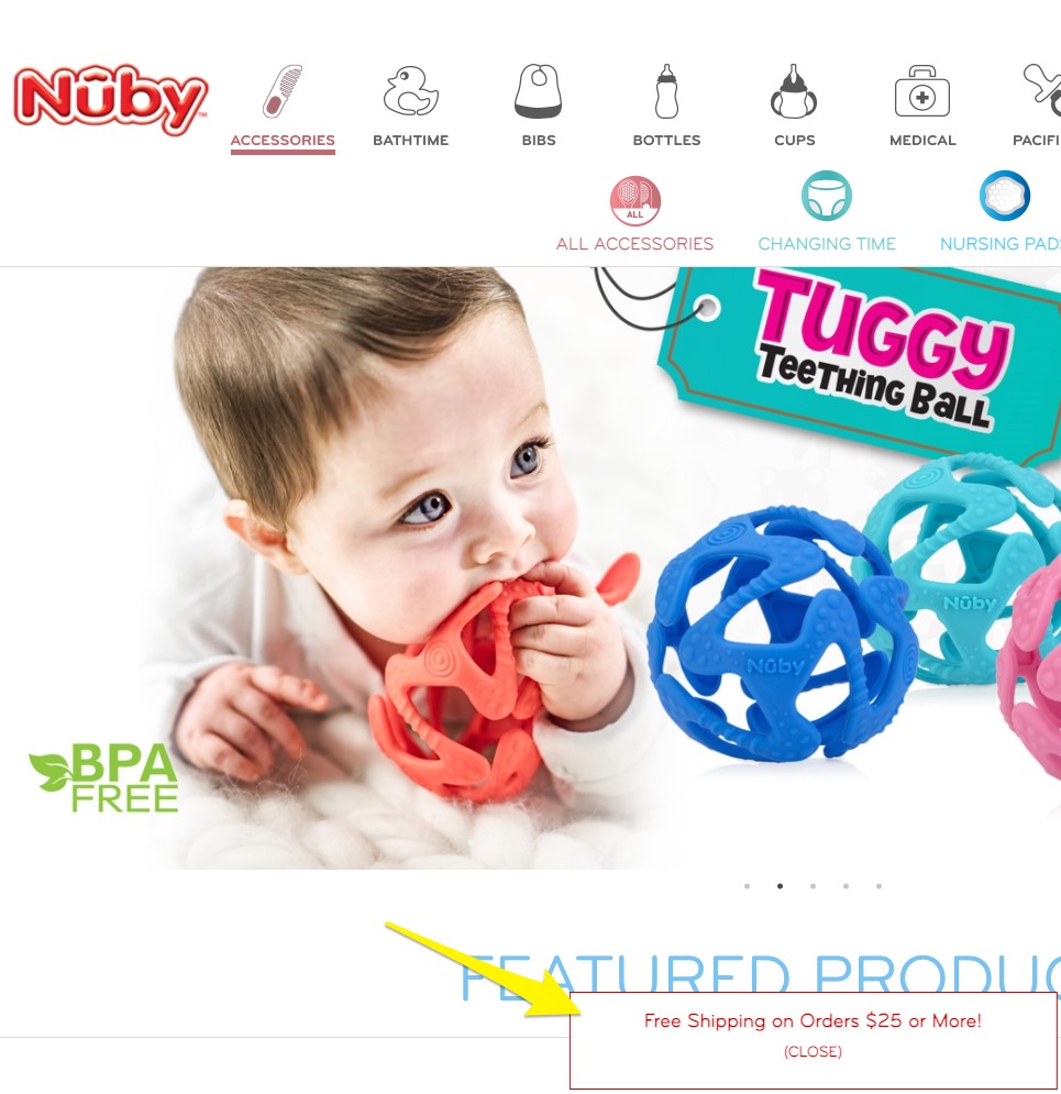
Recommendations:
- We recommend using a site-wide upper bar that interferes with the user experience less and follows the visitor through their entire session.
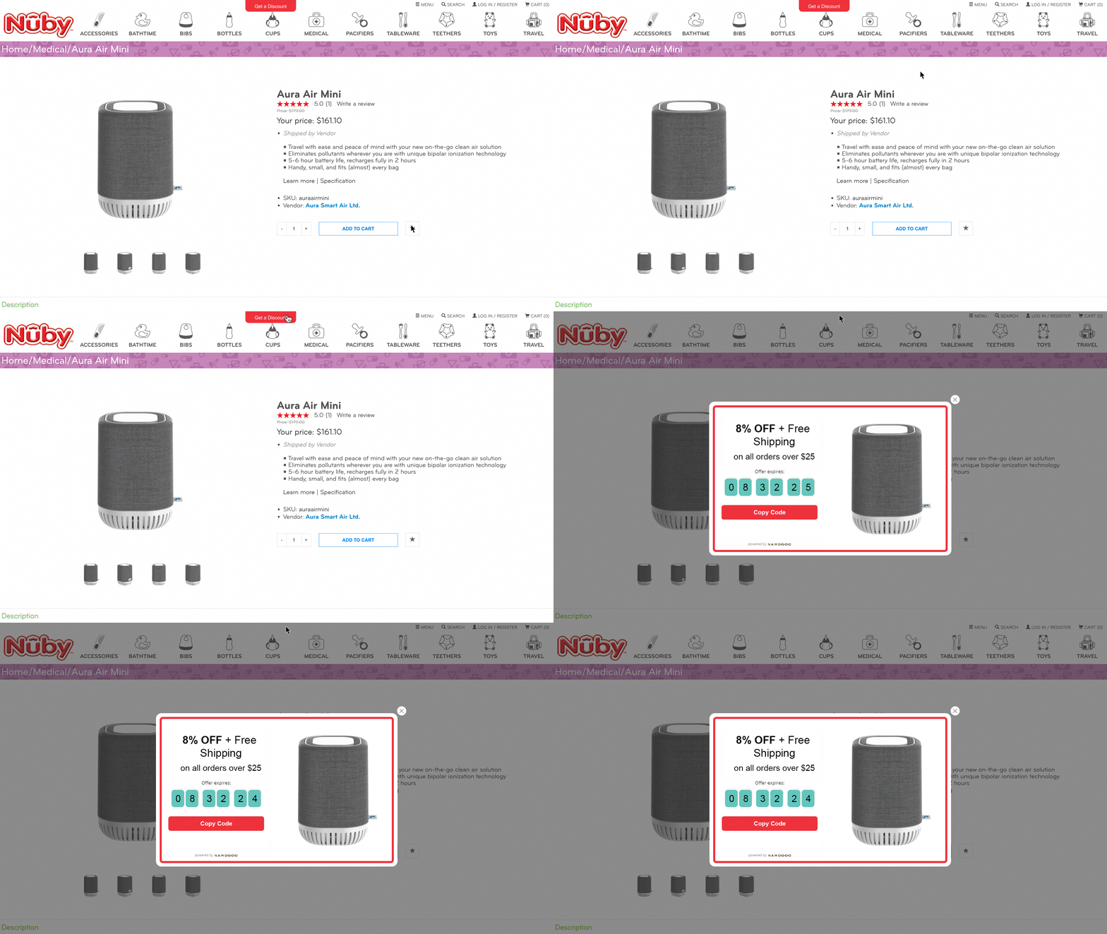
- To remind customers what the order threshold for free shipping is, and to allow them to use it when they’re ready to check out, we recommend activating a promotion reminder. Here’s an example from an Intent-Based Promotions customer that uses pop-up reminders:
- On the cart page or slider, we recommend showing how far the customer is away from unlocking free shipping, and offer personalized related products to help them get there.
- Offer personalized AI-driven promotions, like with Intent-Based Promotions. This will help you save margins on customers who are willing to pay full price, and tailor reduced discounts based on each shopper’s real-time intent. Finally, it can help you convert new visitors by recognizing their needs, and delivering the discount that’s right for them.
Up and Cross-Sells
I don’t think we need to review the benefits of offering related products and other strategies to up or cross-sell your customers.
As always, being strategic about how you offer these add-on items can go a long way for the customer experience, and to your eCommerce profitability.
Nuby’s product pages contain a “related products” feature based on website browsing behavior (specifically the product pages each user has visited) to allow quick access to products the visitor expressed an interest in.
It also displays related products based on each individual’s interests that complement the products they’ve viewed.
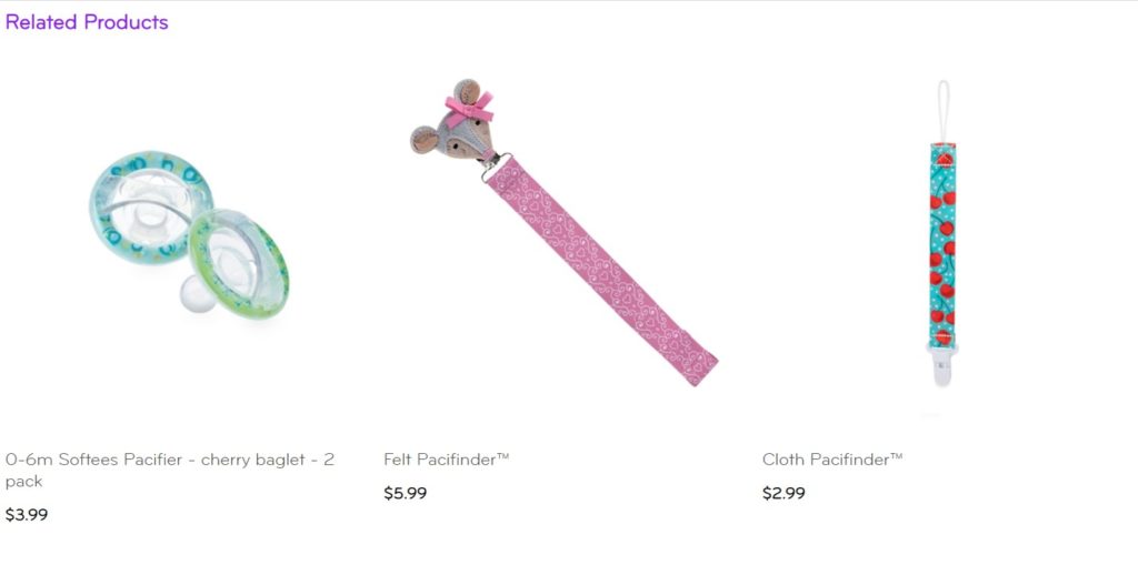
Recommendations:
- The upsell carousel was located just before the footer, way below the fold. We recommend placing this feature a bit higher on the page. Use a heat mapping tool like HotJar to understand what percentage of the product page your visitors view before they click away, and move the carousel to just before that point.
- Offer bundles in the later stages of the conversion funnel. For example, I added to cart the Miracle Placemat and Stackable Bowls, but no utensils. If Nuby had offered me utensils to complement my purchase at a bundle price in the checkout flow, I might have taken advantage of it!
- Post-purchase up-sell emails could be a powerful AOV driver. Incentivize adding complementary products to your customer’s orders in a post-purchase email, ideally the order confirmation email. Post-purchase upsells can convert very well and there’s a good likelihood that your customers will end up buying more products to reach a personalized shopping threshold.
Website Personalization
Personalizing the customer experience is a top eCommerce growth strategy, with 78% of eCommerce executives stating it’s one of their top priorities.
- It’s an incredibly effective conversion driver. 61% of online shoppers surveyed said they’d be more likely to buy from a personalized offer that’s customized to their needs and interests[*].
- It’s a way to allow a more relevant customer journey on the way to purchase.
- Personalization helps brands to humanize their offerings and deliver that personal connection consumers used to get out in the real world.
Here’s how Nuby’s site helps shoppers get the most relevant shopping experience.
Filtering Options
Nuby’s site contains advanced filtering options that is tapping into their customers’ needs.
By doing this Nuby removes friction and allows their site visitors, even new ones, to find exactly what they need, in the easiest way.
That’s contributing to their customer experience, shortening the time to purchase, and lifting their conversion rates.

Up and Cross-Sell Suggestions
Covered before, Nuby’s site offers product suggestions based on visitor behavior (products they last viewed) and related product suggestions based on their searches to allow quick discovery of other products that might fit each shopper’s needs.
Website Personalization Recommendations:
- Launching a product recommendation quiz on the site can be a great way to collect more first-party data from each visitor and offer highly-relevant product recommendations in real time. Use that additional data you just collected to send more relevant, segmented email and SMS campaigns! Nuby could ask about the visitor’s child’s age, gender, and preferences for example.
- Consider personalizing your onsite purchase incentives based on each visitors’ real-time buying behavior, considerations, and motivations with the exact, minimal promotion required to convert. This will ensure you are not only saving margins but also keeping a healthy brand perception by only offering the most relevant promos to shoppers that both need one to convert and are likely to act upon it.
- Implement a personalized homepage with product recommendations based on shoppers’ past purchases, products in the cart, related products to items they’ve viewed, and current best-sellers that fit their child’s age range.
Site Structure and Navigation
Nuby’s site structure is simple and intuitive.
The navigation menu provides a visual representation of each category to make it easier to find specific products, the detailed sub-categories were chosen according to kids’ development stages and take the customer quickly to whatever they are looking for.
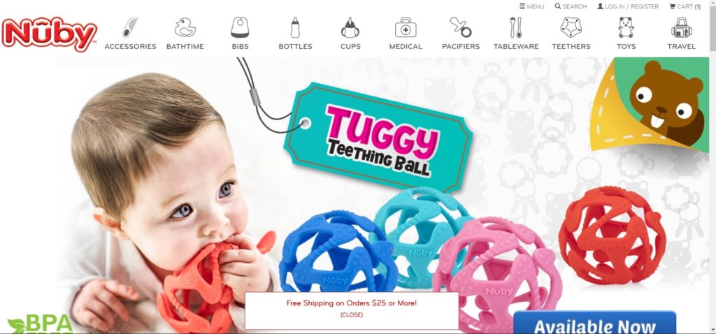
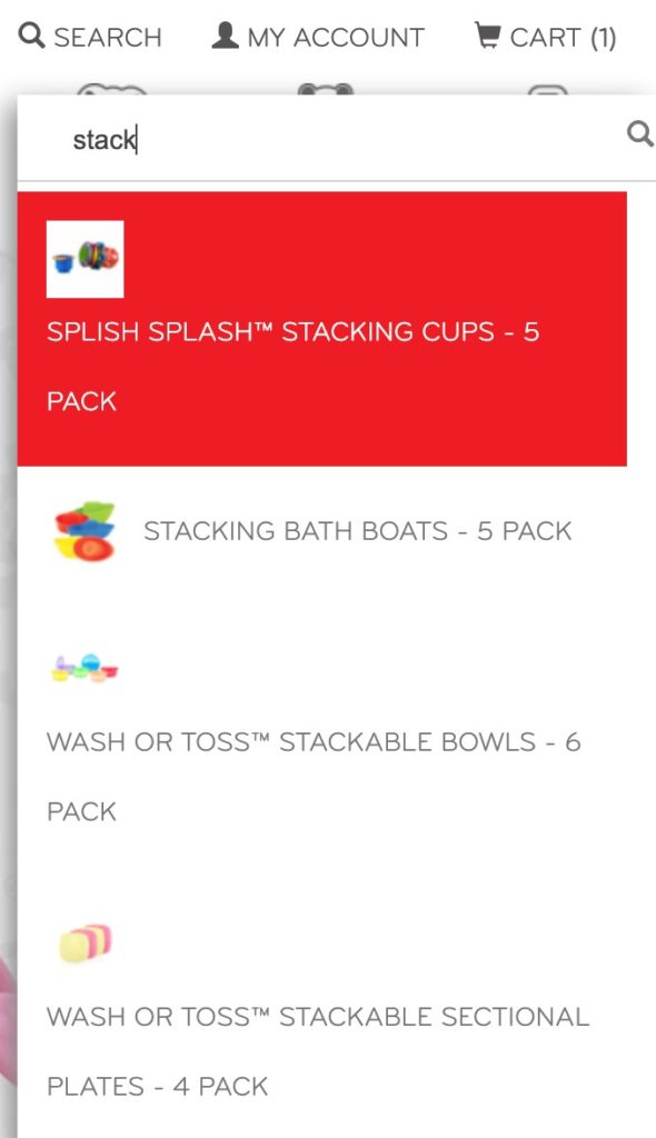
Nuby’s site supports smart search that auto-suggests search terms and displays results with an image of the product:
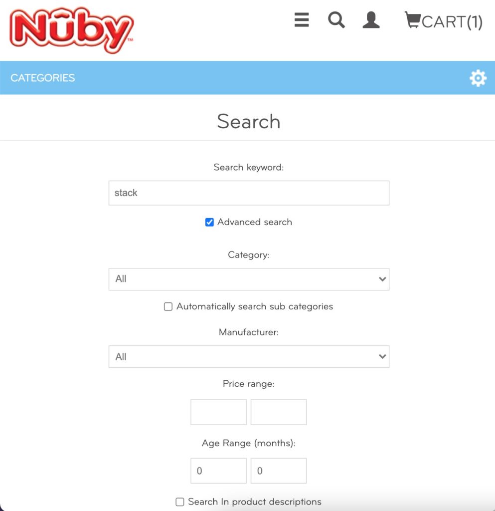
On the search page, users can filter their search results even down to the age range of the products displayed.
30% of online shoppers use the search function when they’re browsing an eCommerce site[*], and those users are almost 2x more likely to convert[*]. So providing a seamless site search experience is crucial!
Recommendations:
- The only upgrade to Nuby’s current site search is to add dynamic, personalized search results for each individual.
Homepage
An eCommerce site’s homepage is typically the page that sees the most traffic.
It’s the digital version of the window display and the foyer in a retail store. It acts as the gateway to the shopping experience, and it should engage with and draw shoppers further into the store.
Homepages should be hyper-focused with a clear call to action and should help your visitors find products of interest.
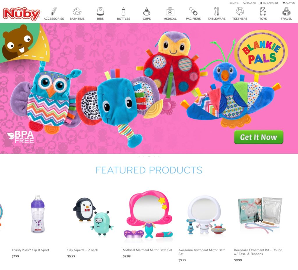
Nuby’s homepage does a great job in highlighting popular and flagship products both in the hero carousel and the featured collection just below the hero.
If you scroll past the top of the page, you’re met with a value proposition of Nuby’s core product line, as well as social proof:
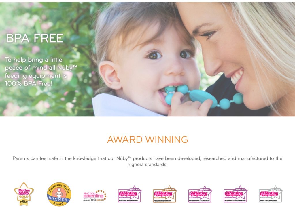
Nuby’s homepage is well laid-out and easy to navigate.
Recommendations:
- Our only suggestion for Nuby is to ensure the call to action is crystal clear by removing secondary CTAs, like following its social media accounts.
Checkout Funnel
The checkout funnel is important to get right for eCommerce stores. Your brand could have a highly optimized onsite user experience, an excellent promotion strategy, and a ton of 5-star customer reviews, but it won’t matter much if your checkout funnel is leaky.
An optimized checkout funnel has a minimal number of steps, makes users feel secure enough to complete their purchases, and lessens the friction in the experience.
- Nuby offers a “quick shop” option by allowing users to add products to their carts directly from the homepage or collections pages. This makes sense as Nuby’s products are mostly lower ticket, familiar items.
- Nuby’s cart page serves dynamic product recommendations that pull from the products the user has already viewed but did not add to their cart.
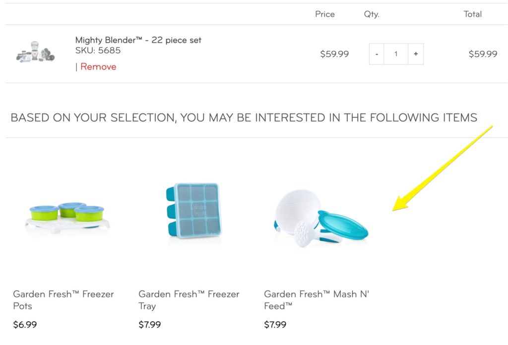
- Recommending personalized products dynamically based on user behavior is a smart way to drive AOV, and Nuby nails this with cart add-ons. The quick-add option appears upon hover, allowing users to add the products without leaving the cart page.
- Nuby provides the ability to apply discount codes directly on the cart page, instead of waiting for the checkout.
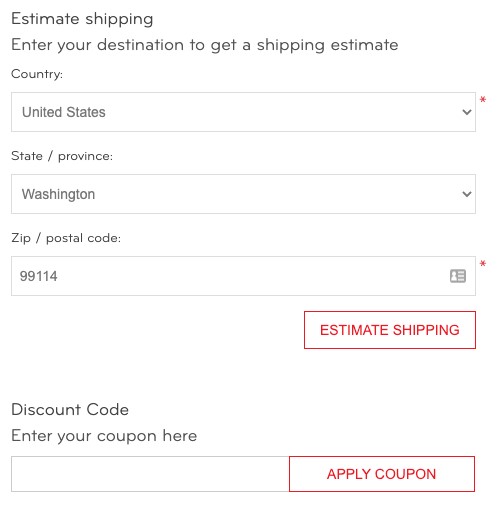
- Providing the ability to apply codes in the cart is often a conversion driver. It gives customers an early “win”, satisfies that rush of endorphins humans get when they save money and provides a more realistic estimate of the order total – which can look inflated if codes aren’t applied until the checkout.
Recommendations
As the checkout funnel is a backbone of eCommerce success, we have several recommendations here:
- It may be worthwhile to A/B test the product recommendation strategy against suggesting complementary products the customer hasn’t viewed yet.
- Consider testing the addition of a second product recommendation section, and offer different products based on each shopper’s needs and onsite behavior.
- Implementing an onsite cart recovery offer, such as an in-cart pop-up that appears when the user shows signs of hesitation can work wonders for reducing checkout abandonment. To trigger the in-cart offer, you could serve it:
a. After a certain amount of time has lapsed (GOOD)
b. When a user expresses exit intent (BETTER), or
c. When the user’s behavior indicates they need an incentive to convert like with Intent-Based Promotions (BEST). - Consider testing a cart drawer (also known as a cart slider) or a simple notification when a product is added to the cart rather than redirecting traffic to the cart page. This can be a high-impact experiment when sending all customers to a standalone cart page adds too much friction.
Checkout Flow
Nuby’s checkout flow is a relatively long, 14-step process on the path to conversion.
Checkout flow: PDP or Quick Shop > `{`Add to Cart`}` > Cart Page (redirect) > Terms of Service Agreement > `{`Checkout`}` > Sign In / Create Account > Cart Page (redirect) > Terms of Service Agreement > `{`Checkout`}` > Address > Shipping Info > Payment > Confirm > `{`Complete Order`}` > Done
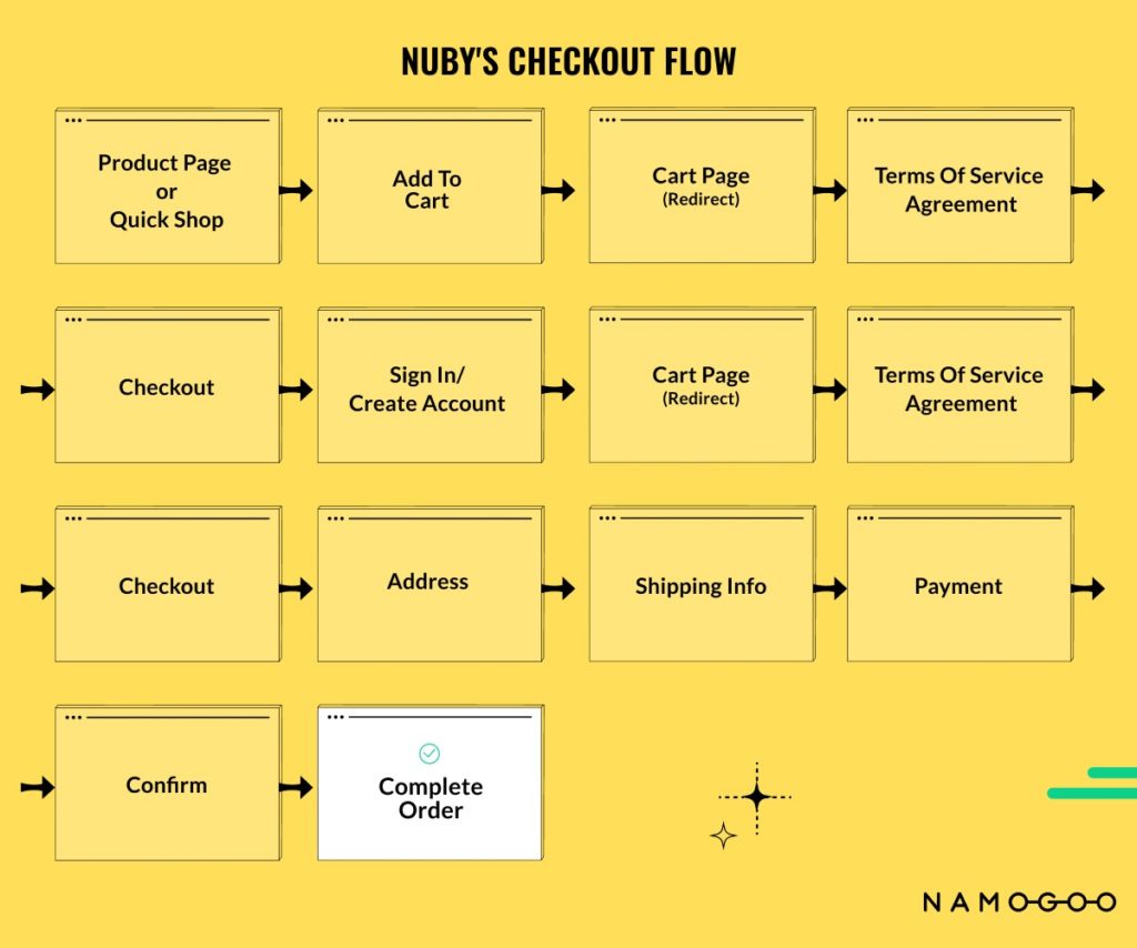
The checkout process introduces some friction points to the user experience, as is common for longer checkout flows.
The good news is that Nuby seems to have ample opportunity to streamline its checkout flow by consolidating steps and removing a couple of (seemingly) unnecessary extras.
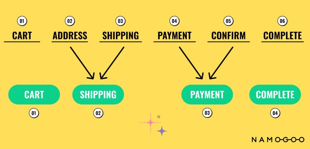
While the checkout flow may seem long, Nuby does have a progress “bar” of sorts. The steps that have already been completed show up in red text:
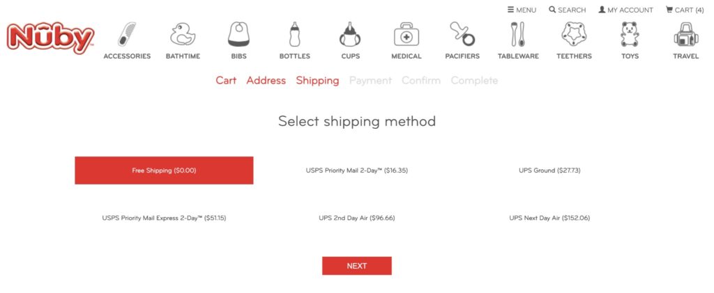
Showing the user how much progress they’ve made provides an anchor, showing that there are only a few more steps to go before they’re done. On the other hand, it shows that they’ve already made it through part of the process. This is a smart CRO move.
Frictions in Nuby’s Checkout Flow
First Friction Point
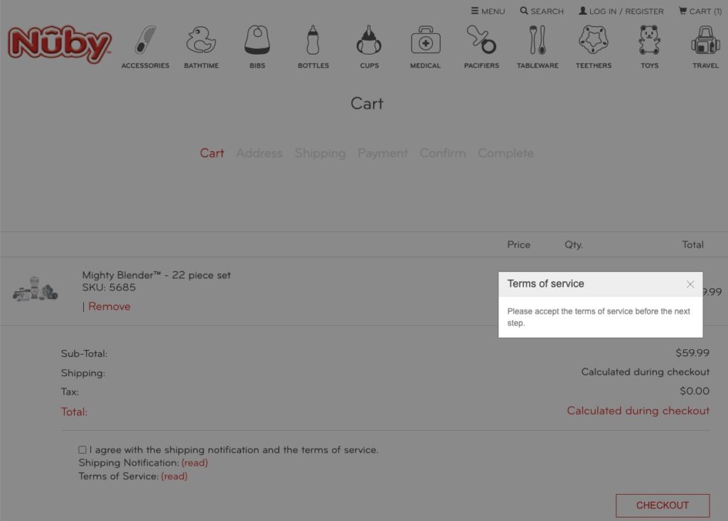
The first point of friction I encountered was on the cart page when I pressed the “Checkout” button. Instead of taking me to the next screen, I was prompted to accept the terms of service before I could continue to the next step.
Second Friction Point
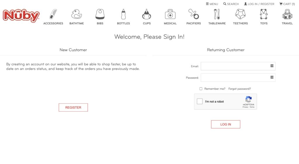
The second friction point was that Nuby does not offer a guest checkout. Requiring visitors to create an account to checkout often causes high-intent consumers to abandon their carts. This point of friction appears once a user accepts the terms of service and presses the Checkout button. The shopper is required to either sign in or make an account to proceed.
Third Friction Point
After users sign in or create an account, they’re taken back to the cart page where they have to accept the terms of service again before being able to move on.
Recommendations:
- Removing the requirement of accepting the terms of service entirely, or moving it later in the checkout flow – perhaps on the Shipping or Confirm step. Customers will be less likely to see this as a roadblock and abandon the process when they’ve already taken it 90% of the way there.
- Offering a guest checkout would undoubtedly improve conversion rate and reduce cart abandonment by reducing the effort required.
- Combine some of the stages of the checkout flow to reduce the amount of friction the user must overcome to convert.
Product Page Quality
If a magic moment in the customer’s journey were ever going to happen, it would happen on the product page.
This is where the brand is tasked with not only with providing you with the information you need to make a decision but to do it in an engaging, strategic, and visually appealing way.
- Nuby’s product pages contain an engaging image carousel with both product images and lifestyle images of the products in use.
- Nuby includes video content on some product pages, but the video shows up in the description area, below the fold which is less likely to be viewed.
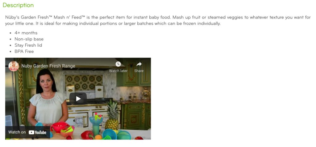
- The core information about the product is above the fold.
- Some of Nuby’s products have reviews, and star ratings are featured just below the product title on the product page. However, the majority of the products on Nuby’s site have zero reviews, which can drive would-be customers away.
Recommendations:
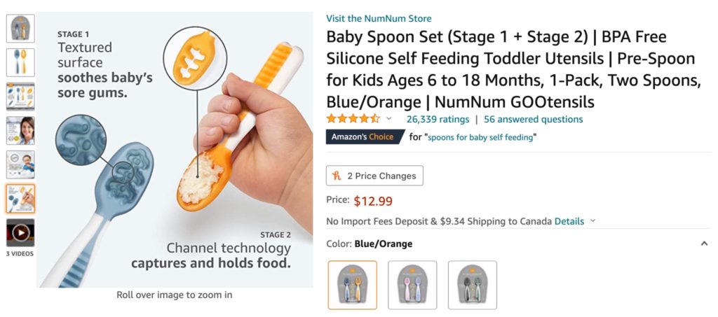
- eCommerce shoppers tend to spend the biggest proportion of their time viewing the image carousel. To capitalize on this attention and increase conversion rates, we recommend testing providing key product details and value propositions directly on the images. Check out how this popular Amazon reseller does this with product images:
- Include more engaging videos showing the product being used in action and moving them up to the image carousel.
- Writing descriptive product titles with keywords that define what the product is.
- Ensuring that the image thumbnails show at least partially above the fold to draw users down the page
- Remove unnecessary and superfluous information.
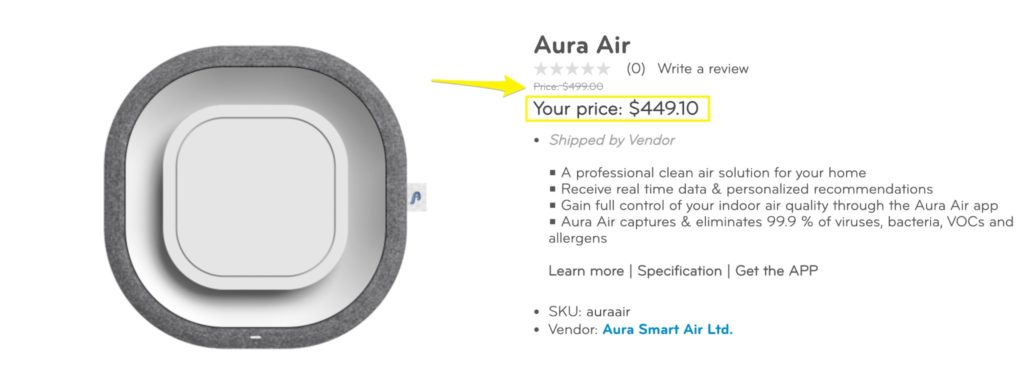
- Display “before” pricing next to sale pricing. How it’s currently presented is easy for the user to miss.
- Gather more reviews. Nuby sends product review emails a couple of weeks after the initial order is placed, which is a great first step. We recommend sending follow-up emails to those who haven’t yet left a review. Incentivize customers to leave a review with a discount or offer on their next order.
Payment Options
Nuby’s checkout offers the standard payment methods, like Visa, Mastercard, and American Express.
Recommendations:
- Enabling an accelerated payment method like Apple Pay, Google Pay, PayPal, or Shop Pay – as shoppers are impatient, especially on their mobile phones, where most online browsing is done.
- Activating Buy Now, Pay Later payment option. Although the majority of Nuby’s products are priced under $20, BNPL may improve cart size as it incentivizes customers to add more to their cart knowing they don’t have to pay for it all immediately.
Part 2: Post-Purchase
After a customer places an order, they’ve reached peak engagement with your brand. You have the unique but fleeting opportunity to build a relationship that could lead to a lifelong customer and even a brand ambassador.
In this part we’ll explore:
Collecting Product Reviews
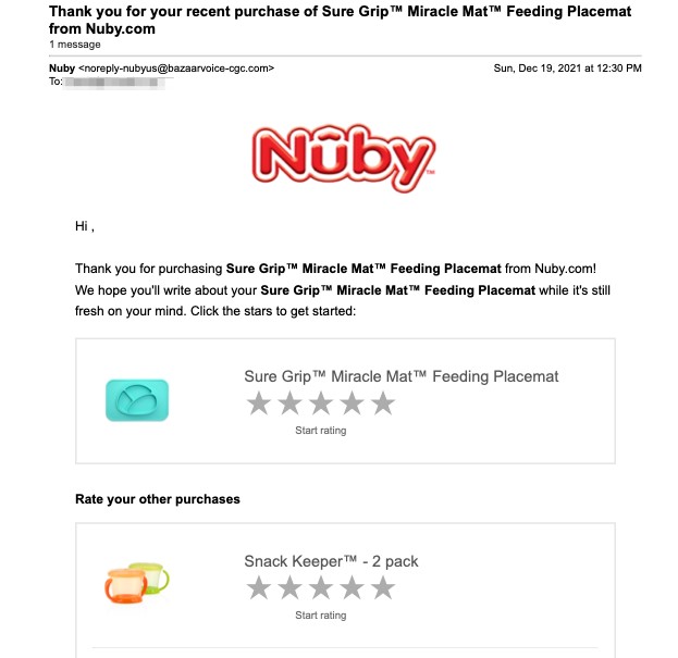
Nuby understands the importance of reviews, and 7 days after I placed my order I received an email requesting a review.
The review email is focused primarily on just one of the products I purchased, which is a smart move. Focus the call to action on the product that would benefit most from more reviews.
Emails & SMS Communication
After I placed my order, I didn’t receive email communication from Nuby aside from the order confirmation and review collection emails.
I also didn’t receive any SMS messages from the brand, and it doesn’t appear that Nuby collects customer phone numbers for text message marketing.
Just after a customer places an order is a great time to upsell customers by recommending complementary products, because post-purchase communications tend to see the highest engagement for eCommerce brands.
Recommendations:
- Leverage this high-engagement time by promoting upsells or add-on items that customers could add to their orders before it ships, or giving the customer a call to action to further engage with your brand.
- Consider collecting customer phone numbers for SMS marketing. Text message open rates are impressively high, and you don’t have to compete with the massive amounts of email that clutters up customer inboxes.
Product Education
While it’s not common practice for most online retailers to leverage email and SMS marketing to educate customers about the products they ordered or the company they ordered them from, it’s certainly a best practice.
Providing some product education through a post-purchase email series can go a long way to improve customer retention and reduce customer service tickets, returns, and negative reviews.
The emails sent in the days after a customer places an order tend to have the highest open and click-through rates experienced by brands. This makes them prime real estate for relationship-building, growing customer lifetime value, and turning casual buyers into raving fans.
Cart Recovery Emails
I did not receive a dynamic cart recovery email when I abandoned my cart, nor I received any further marketing emails or ads that provided segmented information, offers, etc.
Recommendations:
- Since nearly 70% of shoppers abandon their carts before converting, implementing a dynamic abandoned cart email sequence or a remarketing ad campaign can help recover some of those would-be customers by reminding them what they left behind.
- Use a pop-up to gather first-party data about customers. This data can be used to create customer segments for a more tailored experience and better cart recovery.
- If allowing a guest checkout option per our recommendation isn’t possible, it would be a shame not to use the data collected to personalize cart recovery emails.
9 Key Takeaways from Nuby’s Onsite Customer Experience & Strategy
Nuby is a well-known brand in the children & baby product industry, with an established presence in both retail and eCommerce.
Here are the key takeaways you can swipe from Nuby’s onsite strategy as well as our recommendations to optimize your own customer journeys.
- Personalized onsite experiences should be a #1 priority for eCommerce leaders as it upgrades the customer experience by providing more relevant offers (which lead to higher conversions and therefore revenue). Tailoring the homepage, product recommendations, and onsite promotions to each individual will help you not only to increase sales but also to increase profitability. An easy way to start can be with Intent-Based Promotions. Schedule a product tour here!
- The product page is one of the most important pages on your eCommerce site, and the way you display your products influences whether visitors will hit that “add to cart” button or not. Experiment with different types of images, include engaging content such as videos in the image carousel, apply strategies to gather reviews and social proof to empower your PDPs, and ensure that all of the information you include on the page pulls its weight.
- Ensure your primary calls to action are crystal clear and immediately identifiable. Remove secondary CTAs wherever possible to focus users on the action you most want them to take.
- As the checkout flow is critical for eCommerce sucess, streamline your checkout funnel to reduce or consolidate the number of steps the user must take to complete their order. Allow for a guest checkout option if possible, and review your cart and checkout pages for any friction points.
- Enable quickpay options like Apple Pay, Google Pay, and Shop Pay to allow users to check out quickly and improve mobile conversions. Consider implementing a Buy Now, Pay Later option as well, if it would make sense with your average product price.
- As mentioned, customer reviews are highly valuable forms of social proof that can improve conversion rates and give users the confidence to shop with your brand. Provide incentives to your customers to leave a review, and showcase reviews across the site!
- Leverage the impressive engagement that post-purchase communications tend to see by promoting upsells or add-on items, or giving the customer a call to action to further engage with your brand.
- Consider collecting customer phone numbers for SMS marketing. Text message open rates are impressively high, and you don’t have to compete with the massive amounts of email that clutters up customer inboxes.
- Nurture already-converted customers through a post-purchase email, text, or social campaign. Provide them with resources to get the most out of the products they purchased, and invite them to further engage with your brand. This can go a long way to improve customer retention and reduce customer service tickets, returns, and negative reviews.
Recommendations:
- Considering moving the email request to a later date after the order is placed for specific products that one week may not be enough time for the customer to use it and form an opinion about it.
- Adding follow-up emails to optimize the review collection process. The best way to solicit reviews is through an intentionally-crafted product review email series
- Offering an incentive in return will increase the amount of reviews given. The incentive itself can lead to a future purchase or help build Nuby’s loyalty program.
- Adding CTAs on the order confirmation page to allow additional upsells at the same order to elevate AOV on the expense of the same shipment.
- Promoting upsells or add-on items on the order confirmation email – because order confirmation emails tend to see great engagement, this is prime real estate to further the relationship with the customer.


